You can download the preset from here:
[v1.0.0] [v1.0.0] TouchBar Done Right!.bttpreset (1.0 MB)
[v.1.0.1] [v1.0.1] TouchBar Done Right.bttpreset (1.0 MB) (Added missing Play/Pause YouTube without switching to tab)
[v1.0.2] [v1.0.2] TouchBar Done Right.bttpreset (1.3 MB) (reworked YouTube video title recognition (fixed some instances where the title of the video would not be returned) and added a temporary fix for the Netflix "Skip Intro" widget pausing the video)
[v1.0.2] (Folivora link) https://share.folivora.ai/sharedPreset/e7042e42-4b8b-42f8-8854-f3176526e091
Hello everyone!
After a couple of weeks messing around with the functionalities that BetterTouchTool offered, I have decided to finally make my own presets, taking inspiration and some buttons from here and there in the community presets (credit will go where credit is due), as well as adding stuff I thought were missing and deemed worthy of the touchbar. After learning how to write scripts using applescripts and integrating JavaScript commands to them, I came up with “Touch Bar Done Right.”
My touchbar is somewhat limited, as it assumes that Safari is your main browser and that you use Spotify for music (although I’m pretty sure you’ll be able to adapt the applescripts pretty eaisily by switching the “Safari” word by “Chrome” or whaterver other browser you use) but if that’s the case, then you’re in luck cause this preset might just have everything you’re looking for!
Functionalities
This touchbar was built on the foundation of MagicTouch.
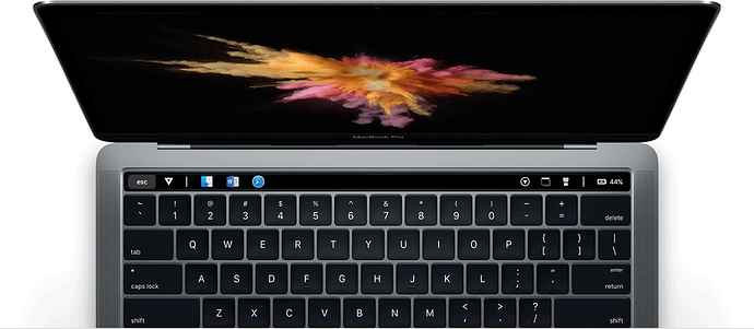
The default view of the touchbar will be featuring a triangle icon on the left which when pressed will open a new Finder window, and when long pressed, force open a new one in the current desktop space (in case one was already opened somewhere else).
Separated with a divider, you will find the app switcher. I put it there cause
I found it to be quite handy when using multiple and needing to switch between each quickly. Also, I like being able to see which apps are opened at a glance.
On the other side, you will find the battery state, which when pressed will bring up a “stats” group powered by iStat (you will have to install it in order to be able to see the stats, but don’t worry, it is free, not that hard to install and you can find it here). The stats show the temperatures of (from left to righ) the CPU, the GPU and Ram.
Next to the stats is an “Eject All” button, which when pressed ejects any and all drives plugged/virtual opened in your computer.
Next to that, is a “Bye, Bye” button. This button close closes every single app on your computer, hence the name ;-).
Pressing on “STATS” opens up the activity monitor.
The battery is then separated with a divider which when pressed brings up the clipboard menu. On the other side of the divider is the “coffee break” button (inspiration from minimalist BTT). This button puts the computer to sleep and locks it as well (this was missing from the minimalist’s BTT).
Then next to it is the “Snap Window” which icon will bring up a group of window snapping functionalities illustrated with icons. If you press on “Snap Window”, the frontmost window’s dimensions will be set to be centered on your screen.
Next to that is the application group. In this group you will be able to set the applications you use the most frequently and hate going to get them in the Dock, or apps that you don’t want in your dock but still use frequently.
If you press “APPLICATIONS” the preferences of BetterTouchTool will open.
This group features a “more” (little ‘+’ sign) button which will bring up more apps that you can set. Those are the ones you might not use so frequently but there a pain to get if you need them.
Now to the good stuff!
All of the above functionalities are a kind of standard or can be done through the software pretty easily.
The functionalities I add are a Youtube, Netflix and Spotify playing now, as well as some other goodies for these apps.
Lets start with Spotify:
The Spotify widget comes on only when Spotify is open and shows the name of the artist and track currently playing, as well as a previous and next song buttons surrounding it. The name of the track acts as a play pause button, and when long pressed opens Spotify.
Youtube:
The YouTube widget also shows up only when a video is playing. It shows up the name of the video currently playing, as well as a button that allows you to come back to your subscription page. If you press the title of the video, it will pause it and tell you that it is paused. If the video has ended, it will also tell you so. Long-pressing it will bring you to the currently playing youtube tab.
Best for last, Netflix:
This is my pride and joy, I spent many hours trying to make it work just the way I want, but it was worth it. This widget will only show up when a Netflix video is playing and will show the name of the episode currently playing, as well as the episode and season numbers. Taping the name will play and pause playback and tell you that it is paused. Just like youtube, if you long pressing the name will bring you to the Netflix tab. Next to the name is also a back button which will bring you back to the browsing screen.
When the intro starts playing, a button “Skip Intro” will show up and disappear when the intro has ended, obviously, pressing it will skip the intro.
Once the episode ends, a button “Play Next” will show up and when pressed will play the next episode. It will disappear once the next episode has started loading.
That’s it for my preset. I hope you enjoy it!
Feel free to strip it down and make better touch bars with it and tell me if you find any issues that might need fixing, or more efficient ways to do some stuff.


 )
)