I’m pretty sure you can play with the parameters. Apple’s guidelines recommend using their materials but its probsbly possible as they mention “to get the right Vibrancy, Tint and Blur” or something.
I’ve played with the material in xCode for a just-for-fun iOS app I did. I think it’s possible, but that was for iOS.
Hmm, I’ve seen darker/lighter stuff here and there. Search around a bit more, but if not then it may be good if you just put your own tint over it by overlaying some transparent black on top
See my comment above again, I think I’ve covered everything I wanted to feedback
Edit: If you do find a way to customise it, try tune it for the white background then see what it looks like for the desktop. When I was mocking up, I had an artifact which produced a navy-coloured translucency (I think you can see it in my first mockup post) and that looked OK but a bit off. Like the dark dark better, though)
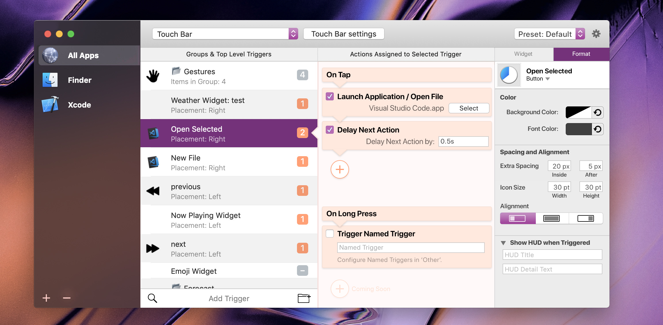
@Andreas_Hegenberg, Stare at it and try imagine yourself using it before you open the notes below. See how many of the notes you can pickup without an initial explanation!
Notes
Toolbar
Device Triggers and Device settings moved to the right of toolbar. Also make that button longer than as displayed in my mockup (like yours in your latest posted update screenshot) as I think it needs more attention.
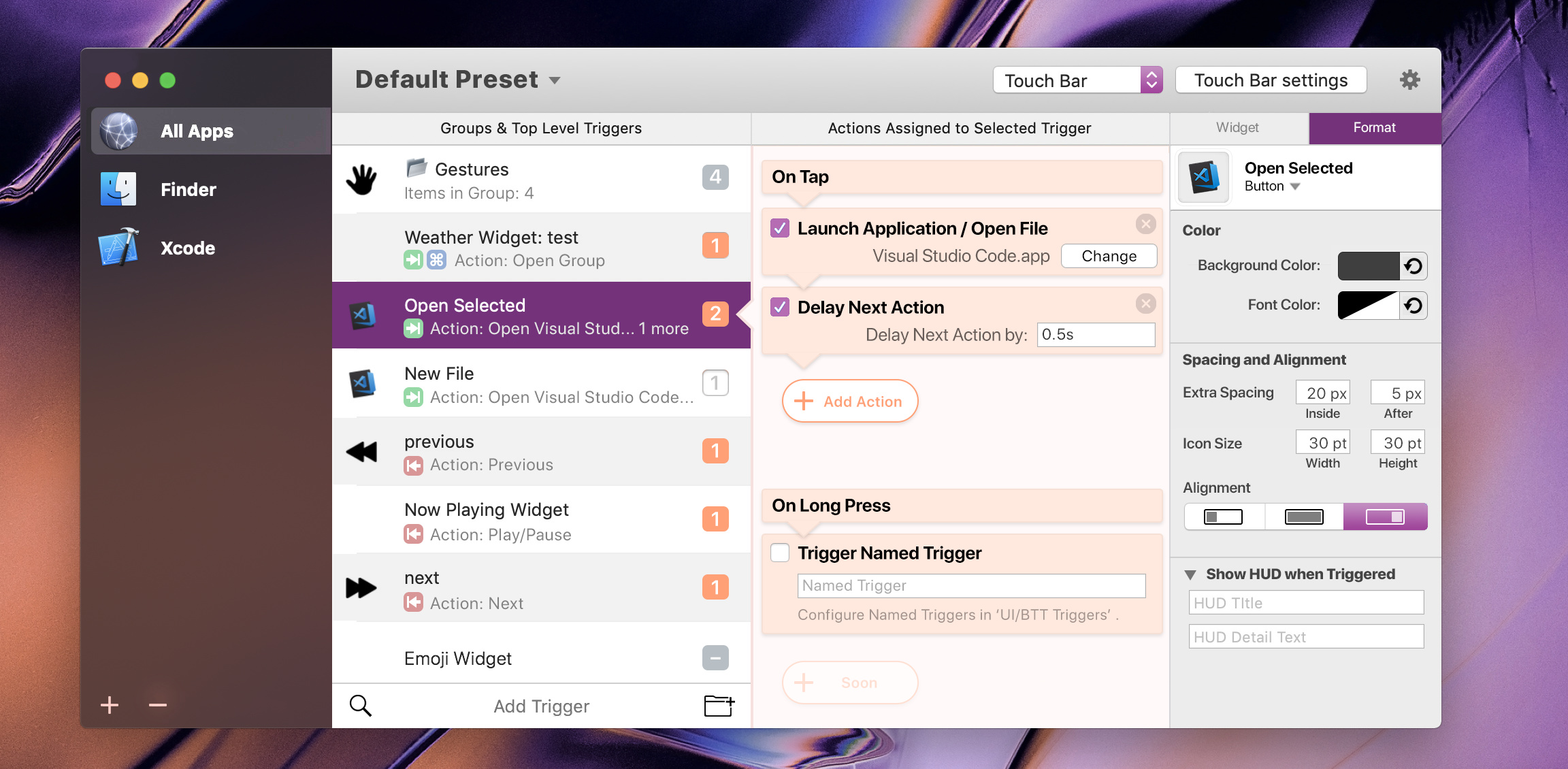
Click the 'Default Preset' title to change, well presets. This title will obvously change to the currently editing preset, (e.g. Aqua-Touch v2.1.1, GoldenChaos-BTT. 'Preset' will not always be added at the end, it's just the name. 'Default Preset' is the default name now.?
Triggers Column
Placement and Modifiers (in the subtext of the cells) are now icons in the trigger column. Saves space but remains there to see. Using the extra space we can add a preview of the actions like the current table view.
Preview of action/item counters that are in deactivated(4th from top), numbered(3rd), N/A(EmojiWidget) or Group states(1st).
Trigger Column (second from left) has alternating cell backgrounds now.
Left Apps Column
Centered the Window Buttons.
Improved the look of the current selection.
Improved the Add and Delete buttons.
Removed App-Specific button as this will appear in the Right Setup Panel on selection as explained in the Right Setup Panel section of these notes below.
Orange Actions Column
"Add Action" button modified. More Beginner Friendly.
My idea of Action modules are finally 'fully' mocked up. Get it now?
Checkboxes deactivate/activate modules.
When adding a new trigger, the default module already 'installed' would be the keyboard shortcut one, ready to either have a shortcut inputted into it, or deleted and replaced with predefined actions.
I've mocked up the On Long Press(renamed) considering your temporary incompatibility. This would always show and won't be deletable untill you decide to implement the modular design fully.
Made colours pop more in Actions Panel. Note: No icons for the actions here. They are easy enough to recognise due to how the module itself looks, and their clear title. It would be good if icons remain in the "Add Action" Palette though, as thats a huge list and an icon is convenient in those. tldr: No icon in module, icons while adding.
Note the speech bubble 'triangles' on the left side border of the actions column and the modules. These give the user context and let the user know of what they are controlling.
Right Setup Panel
Brief mockup of Right Setup Panel. Of course, more options will be added.
Note the 'Widget' and 'Format' tabs up top.
This is incorrect for the current selection as it is not a widget, but that widget button will appear if a widget is selected and is where the widget is set up. It's just for illustration purposes.
The proper display for the current selection would just be the format tab in grey with no widget tab. This tab will change to 'App Specific Behaviour' if an app is selected, etc. The dynamic title lets the user know what they are editing and what's selected.
Background Changes
Maybe add "Triggers" after each device, (e.g. - I referenced "Configure Named Triggers in UI/BTT Triggers". similarly, "MagicMouse Triggers", "Trackpad Triggers", "TouchBar Triggers", etc. (not mocked up here)).
To keep things neat, maybe only show "Triggers" when the dropdown is collapsed, and don't show "Triggers" in it's list. (if you can do this)
"Other" trigger device renamed to "UI/BTT Triggers"
Collapsible attributes in Right Setup Panel if they are optional. (as seen in Show HUD)
Looks very nice!
I'm out for the weekend, so I'll have a closer look on Monday, but this definitely incorporates some things that I really like (especially showing the action on the left column).
If you need some life time licenses for BTT - let me know, your work is great!
I also like the default preset selection like in your screenshot!
Have a great weekend then, Guess we’ll continue on monday.
For Andreas_Hegenberg
I’m also considering to offer renovating your icons as well, (e.g. action icons) as they seem quite tired... (Actually, they seem OK. They're just a little inconsistent)
I’d be happy to do so, send me over the dimensions or all the icons themselves so I can use them as references and make you some more streamlined, livlier, cleaner ones. (well, i’ll try to anyway)
BUT i’m also under the high workload of the final years of High School so it may take a while. If you don’t mind a slow merge of new icons over many versions then I might get pushed towards doing them for you, but if so then do consider that this may take a long time!
Anyway, thanks so much for your generosity! Additionally I’d like to ask if I can mention this work in my portfolios for uni and jobs and stuff... Thanks!
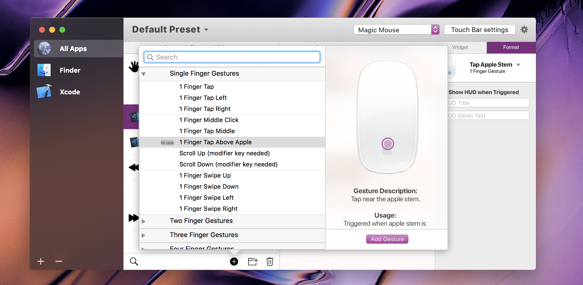
Experimented with new gesture display
(its quite rough but you get the idea from it)
Not sure about the translucency...
The touch gesture animates on the mouse as you mouseover/click the triggers in the list. Description and Usage displayed below.
Mouse and description is a scrollable container, so scroll to read Usage. Add Gesture to, well add gesture.
Note i’ve refined the trigger column action bar (at the bottom. Now has a delete button and can display an “Add Widget” icon in touchbar (I have it mocked up but not showing yet untill further touchbar UI improvements to post since that isn’t a post worthy change)
Looks nice! (Creating these animated pics is quite a bit of work though - probably something like this won't be in the first iteration).
I have made a lot of under the hood progress (e.g. dynamic and multi-language generation of the right side-bar content) but not much visible progress.
It's on a good way though, everything seems to work as I imagined
The dynamic side-bar was a big step and now it's just a lot of boring text-entry work to transfer all the old config modals to the new format. After this is done I will work on finishing up the base UI and then we will have a first working version
Unfortunately I will need to work on another project for almost two weeks so possibly not much progress will be made until after.
Sounds great! Take your time on that other project!
As for animating the pictures, I have some experience in that and I might be able to lend you some help over time. I do have a high busyness though so this may take longer than I would want..
Would these be image sequences, or some other format?
Also, is this purple appearance part of BTT or is it just your Mojave preference? I think it looks quite nice, if you could set it for purple in BTT. (this will also greatly reduce animation sprites if those are happening)
I think the best way to save such animations is mp4. This would probably just be a webview which loads the animations from my server (probably doesn't make sense to include all of them in the app bundle), so it could be any format that can be rendered in a browser.
The purple is my Mojave accent color.
Another way, which may be easier to do and easier to adapt in the future would be doing the animations programatically. This would also solve the accent color issue nicely.
Btw.: the first alphas of the new UI will probably only work on Mojave because I really wanted to use all the great new APIs and just used them without checking the required OS. I think even in future versions the minimum OS for the new UI will be 10.13.
Ah, Mojave accent color preference I see. Would it be possible to override BTT for purple since the warm orange doesn’t (or might not) “harmonise” with some others.
Using web-hosted videos might take too long to load, may not be smooth and might be hard for you to create new/update if I make and render for you, even if I send you the (AfterEffects, I think) files.
Another idea is that we could create sprite animations / image sequences of just the gesture indicator (e.g. the animated graphical dot for click, tap. force click and slide) which are stored in BTT. You also have blank images of the magic input devices.
With these resources, you can then overlay and position these assets over an input device. The dot/graphic itself would animate over the input device at your set position.
Essentially, you’d have something like animated stickers you stick onto the magic mouse/trackpad which change location/image as you wish.
If you make a new gesture or if new input device comes out, you can easily use these animated “stickers” for the new stuff.
Not sure if you understand, but this would be easy to edit and create new, it would be a smaller file size, easily editable and future proof at your side!
I cannot wait to see the new design IRL Just checking @Andreas_Hegenberg - you've mentioned that you're planning on internalization of BTT - will you need help with translating it into other languages? Do you somehow plan on enabling users help you in that matter, even by simply sending you the JSON for particular language or something?
Hey @Andreas_Hegenberg , I have not had the time to read through this whole thread, but the new interface is looking quite nice! A few considerations though:
Personally, I like having separate icons for mouse / touchbar / trackpad / etc at the window header. Besides finding them aesthetically appealing, I'm constantly switching between them and a drop-down menu would impair my ease-of-use.
The same also goes for most of the other buttons at the window header - Gestures / Adv. Settings ... and ... Mouse / Trackpad / Usage / News. I use these substancially and appreciate the easy access.
So, in short, my preference is that you do review the layout and design aesthetic of the aforementioned items, but also do keep them as they are now - 1-click buttons.
I’m pretty sure you’ve seen my mockups above and i’ve been quite active in the development of this new UI. I’ve discussed this issue as I also initially agreed that the dropdown was an inconvenience, however @Andreas_Hegenberg has mentioned the implementation of keyboard shortcuts into the new UI.
What would you think of hitting command-1to9 to switch Input Device?
Also, I’m mot sure what that top right Gear icon actually does, but i’m sure thats Adv. Settings.
We’re overall trying not to overwhelm basic users who only want to add a couple of gestures and keyboard shortcuts. This is the main flaw of the current design, it’s too overwhelming for basic users. This is the main reason why many of the buttons have been removed/grouped.
@Andreas_Hegenberg
Though Keyboard Shortcuts would be nice, I think we should implement a customisable toolbar, where advanced users could use a smaller preset switch (referring to my latest designs) and throw in their preferred icons.
The toolbar is the main argument between basic and advanced users, but I think the rest of the window (and it’s columns) caters to both just fine.
Having worked a bit with the new interface I can definitely say that it is faster to use than the old one, even if you are an advanced user.
Full keyboard shortcut support and menubar (which the old BTT didn't use at all) make it nice to navigate. The side-bar gets rid of many extra clicks. The advanced settings do not exist anymore and are now directly accessible by pressing the settings button next to the popup button.
I have prepared the UI to be able to add a toolbar on top if necessary, but I'd first like to try without and get more user feedback (when it is actually usable).
My current approach also is to put other "features" like window snapping in that dropdown, but I haven't finally decided on that:
(Don't use that in BTT as it's not legible at small sizes. Some stroke widths and stuff need to be changed for that
I suggest you rename "Other Triggers" to "BTT/UI Triggers"
Additionally, BTT Remote icon should be a phone to avoid confusion
Finally I suggest you put the keystrokes "⌘1, ⌘2, ⌘3, next to the items on the menu
Other than that, I guess an Icon rework and it'll be all good!
I'm not entirely sure what that new Window Snapping & Window Moving contains. How would we assign actions to that?
The new UI from the Screenshots above looks fine! Also the mock-ups from yyuuiko are very nice - especially the right side is very clean - reminds me of Sketch app. And the activated button style (without border) on the left side looks cleaner too.
I agree that the icons should be updated, not only the context menu icons, but also the “Global” icon. That 3D glossy effect is pretty outdated.
I love the search and the possibility to select multiple entries! Currently it’s hard to find Buttons if you have a lot. I would also welcome a “duplicate” function - that way I don’t need to copy/paste the JSON of the button when I am creating multiple buttons with same style.

 (tests how a new user would recognise all the controls)