New BetterTouchTool UI Progress

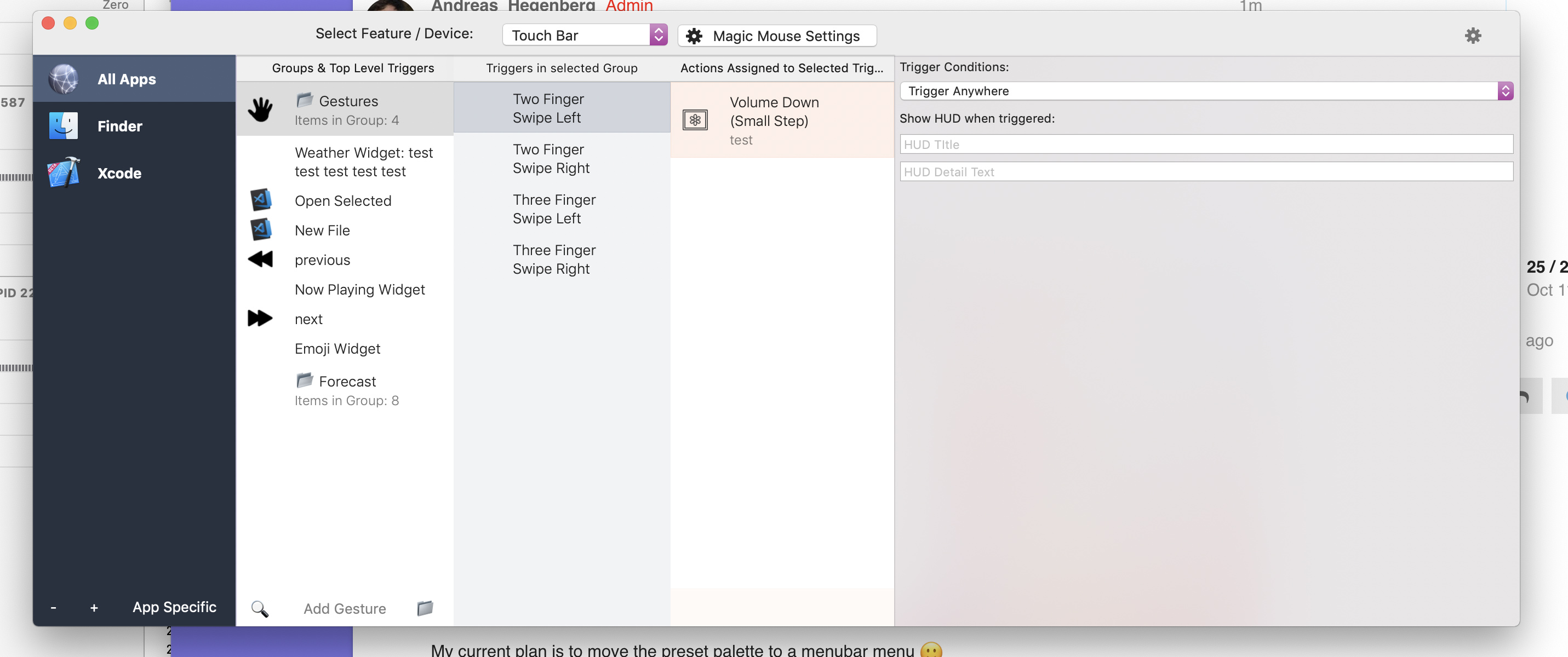
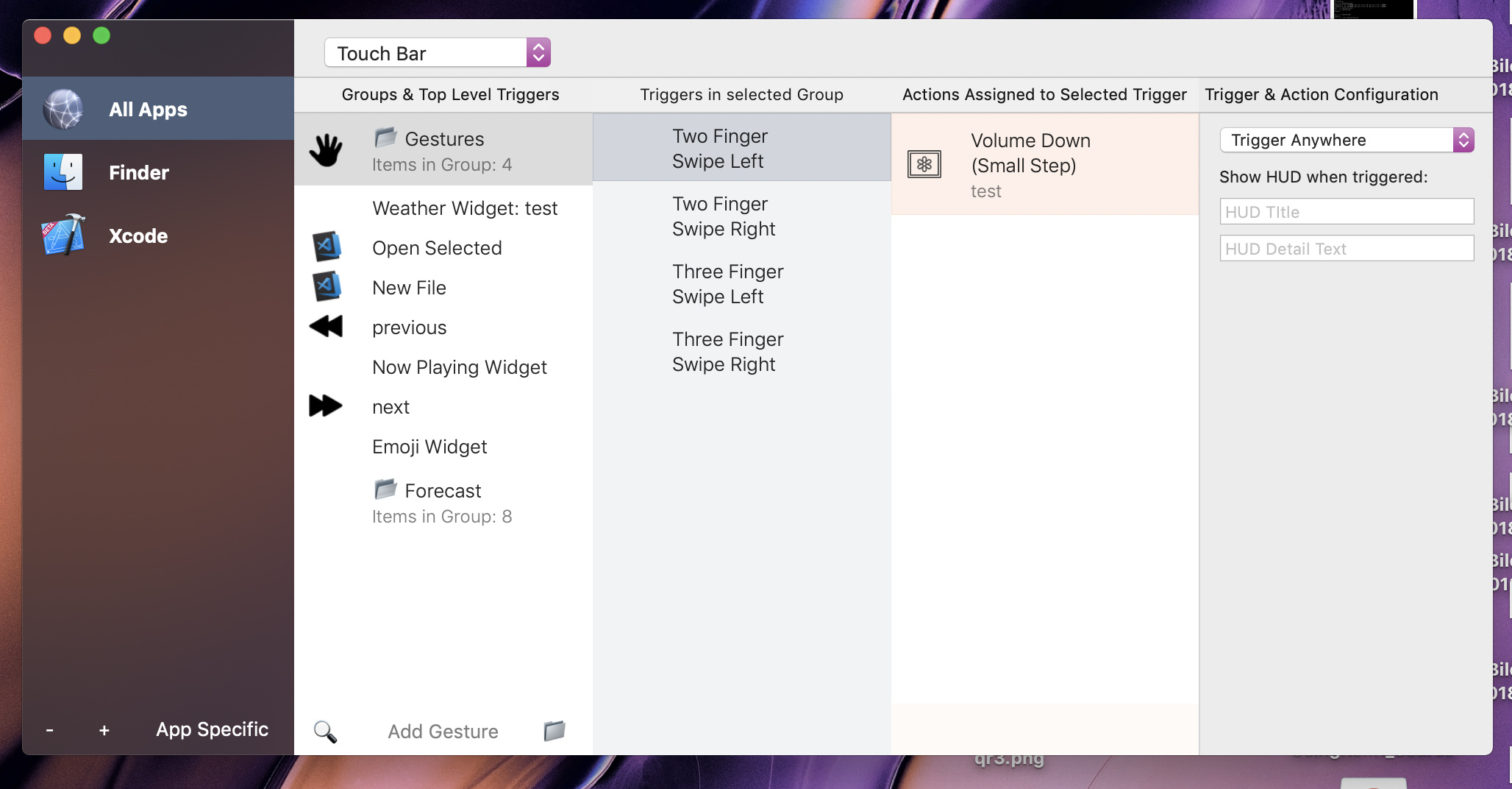
@Andreas_Hegenberg, I've started a bit, current progress:

I still need to put my ideas into the trigger column and the config column, and also I plan to refine lots of my changes like the icons and buttons and everything.

It got late and I wanted to get this out, so here you go.

Notes:

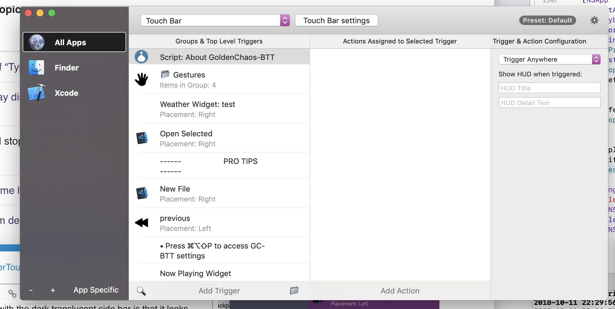
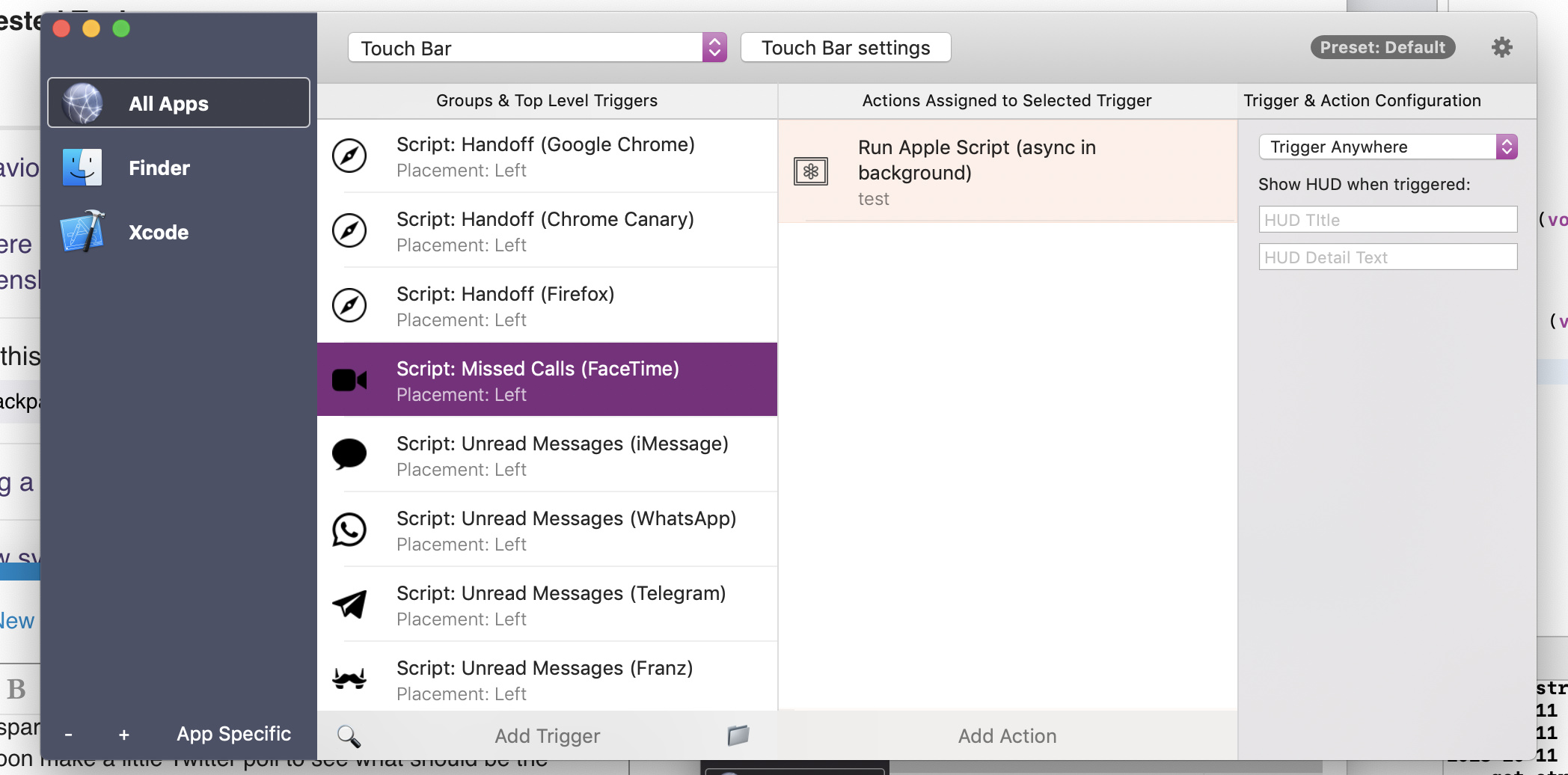
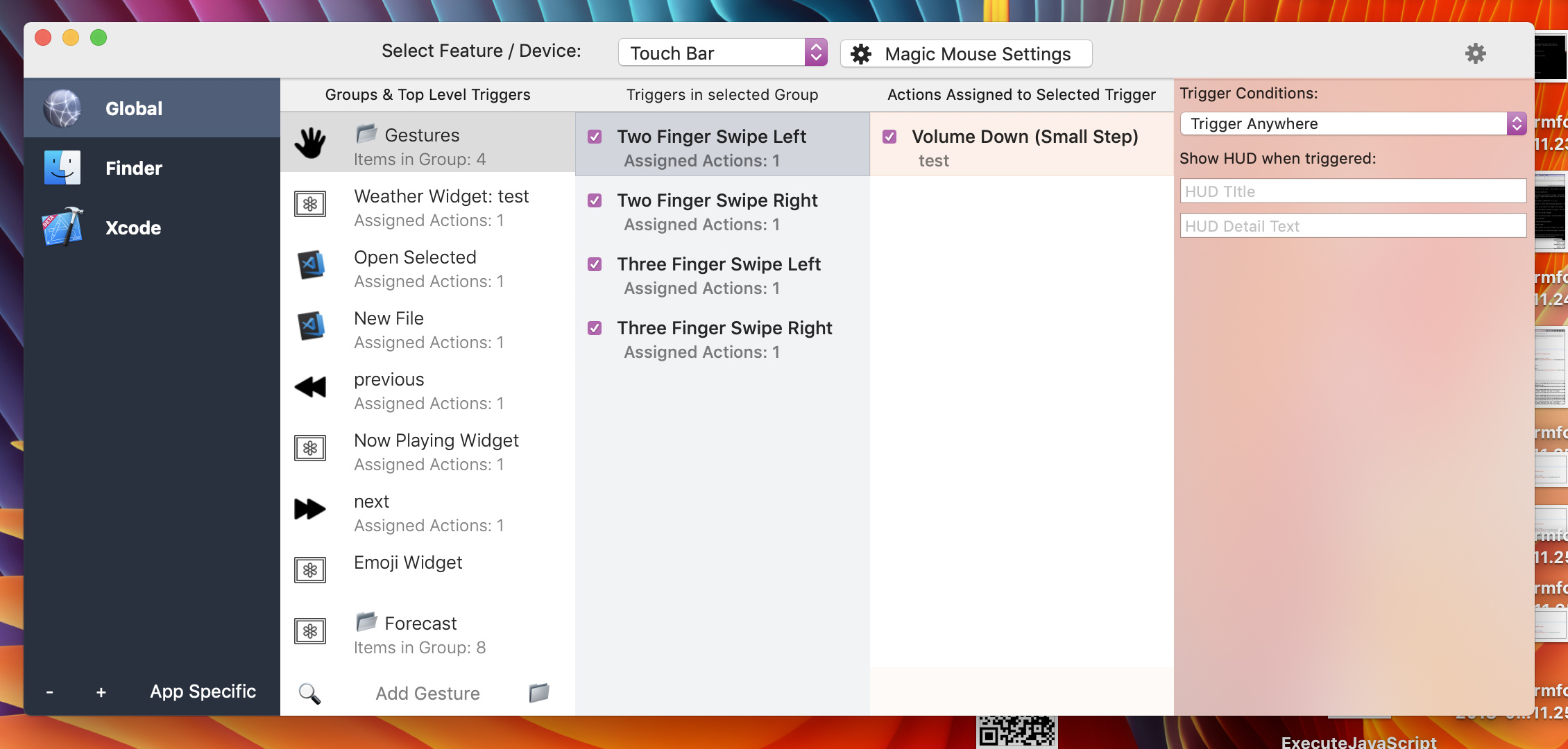
  • The squared '1' (hard to see, will change) is the number of actions. Maybe use click to disble the trigger?
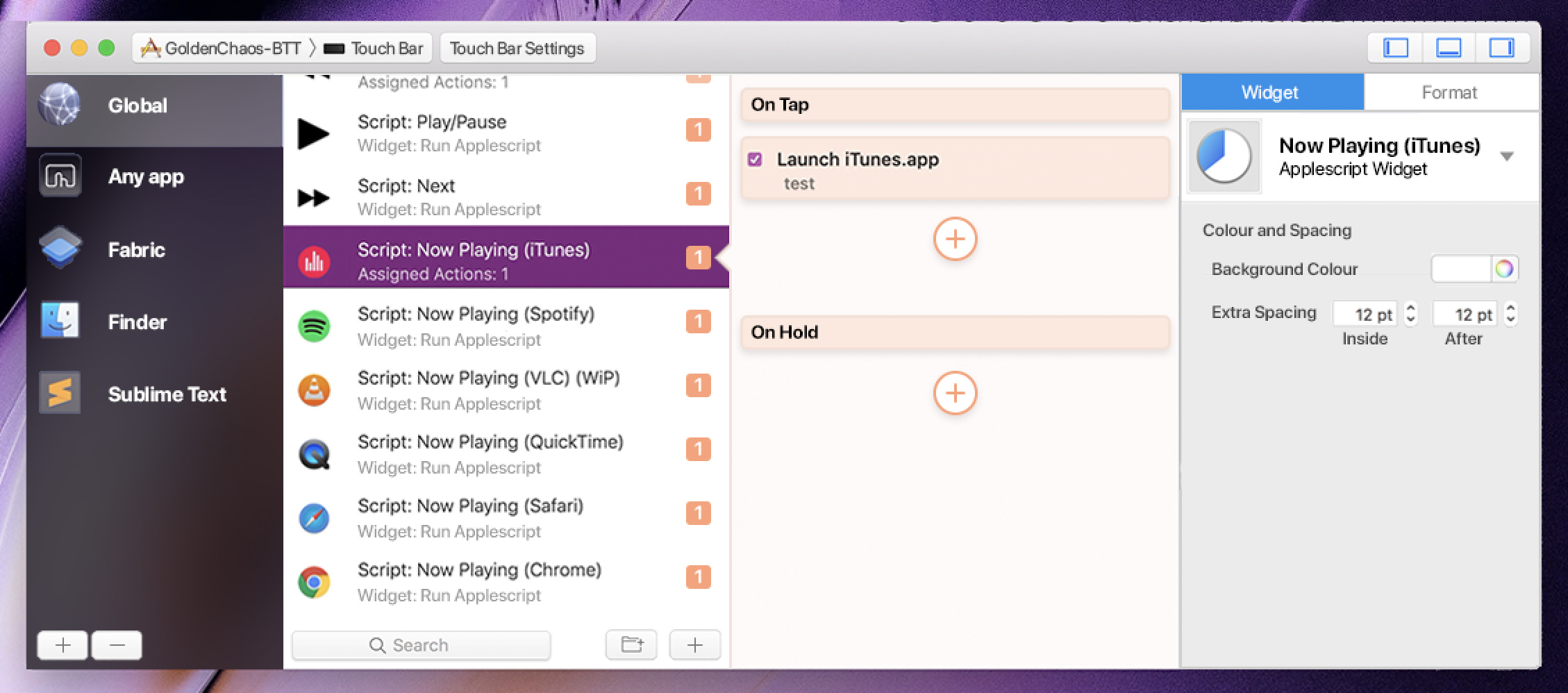
  • Assigned Actions: 1 has been changed to display the type of trigger (Widget, Gesture, Normal button, etc)
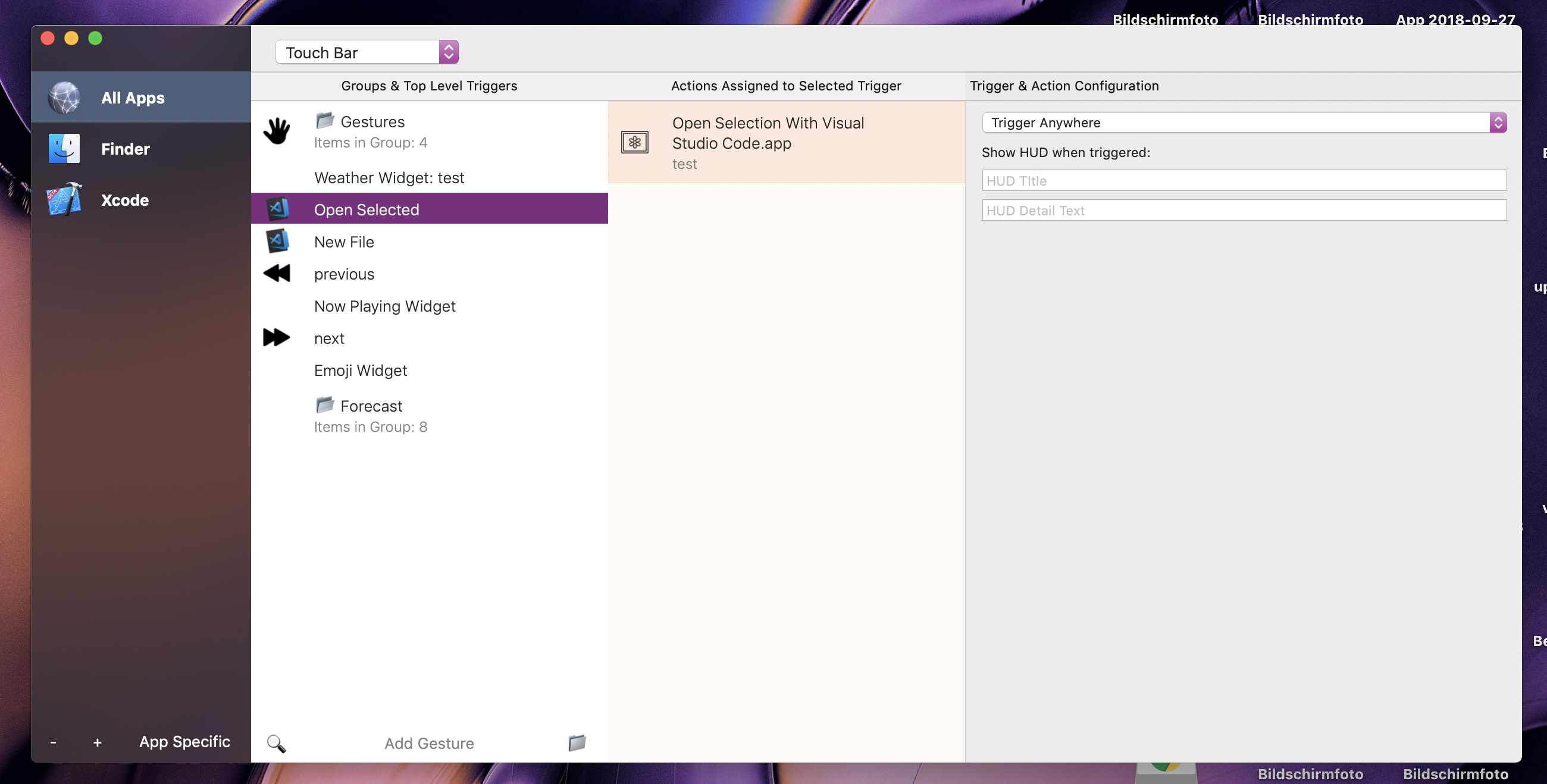
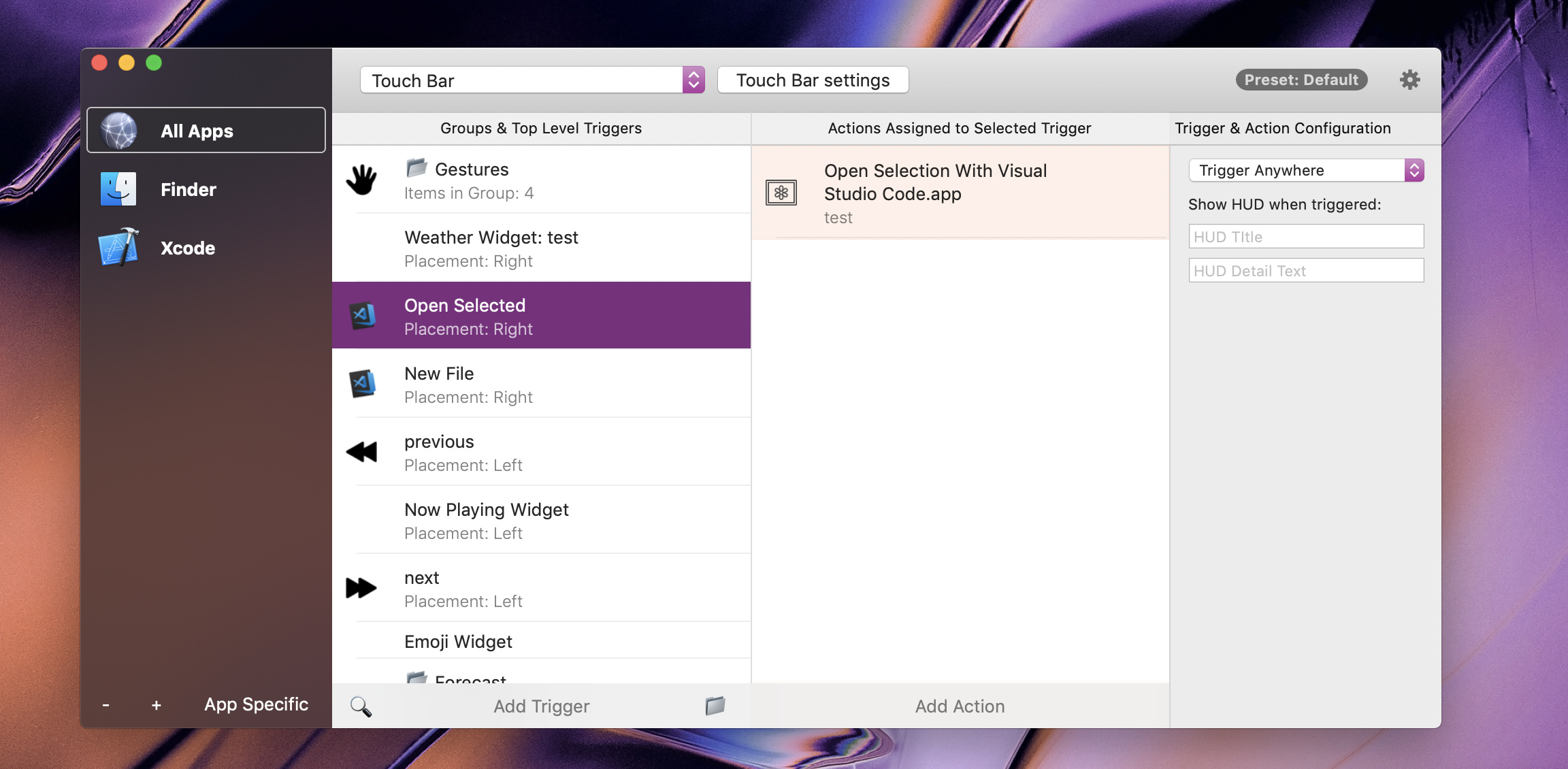
  • App-Specific Config removed. Options will appear in the leftmost config bar when selected.
  • Modular Actions Column design - similar to iOS Workflow / MacOS Automator
  • Dark Translucency (MacOS Calculator) added to sidebar. I am yet to change the top bar to normal osx grey/translucent to window (safari toolbar).
  • Change Global to "All Other Apps" and add "Always Show" (good for play buttons and custom escapes.
  • Going to change the "Add Gesture" layout that I think would be better
  • Going to add all kinds of toggles into the action column, to give you a reference, maybe.
  • Going to add more device icons and device labels
  • Refine contrasts and design details

Consider that this is not my 'final' and I agree that contrasts, system-theme-flow and just the general mess need to be worked on. This is just a preview of my current work. Gives a general idea of my suggestions, but not all of them just yet.

Thank you! I like many of the ideas and will post an updated version which incorporates some of them soon!

I'm currently experimenting with having the right side bar translucent. I also tried the dark translucent mode for both bars, but it didn't look good when the app behind BTT was white. Then it's just some ugly gray.

That's a bit like finder which also has only one translucent bar (on the left though)


A few comments on your ideas:
• I like the number of actions display and disabling by clicking that is also a great idea!
• Type of trigger is also great, I was missing that.
• Modular action column design is something I need to play with a bit, I'm not yet sure whether I like it or not :smiley:
• Changing Global to "All Other Apps" probably won't be possible as it would break many existing setups. It may work for the Touch Bar tab though - I'll need to think about that. Also technically ;-). I could rename it to "All Apps" though.
• I don't like the icons on the top anymore. I want to make it simpler with less graphics. I want it to be able to fit in more triggers without needing to scroll. I'm not yet sure if the popup button is the right solution, but after having used it for a while I think it works OK.

Whoa, I did not realize that there was a thread where you stated the progress on UI changes until now :slight_smile: I'll think about some things that I'd find useful and share with you - and, if you want - I can talk with my befriended UX designer, with whom I love to work and whose solutions I love, so he can leave some ideas here too :slight_smile:

Hi, Thanks for your reply! Glad I could contribute some ideas.

Feedback on latest post:

Right Side Bar

I don't think the right side should be translucent since it's 'usage hierachy' is placed last. Translucent elements should be interacted with first, as it is 'closest to the desktop'.

Dark Translucency

Apps that use dark translucency as the sidebar look great though. Bartender, Spotlight with Dark Menubar Mode and an app I have - "Textual" which is an IRC client, have great implementations of sidebars.
I don't mind the grey, it's not that ugly. They have more of a 'really dark black' when a white app is behind. Maybe I'll edit in a video soon enough. The calculator was a bad example, since it's a little lighter than most. I'm pretty sure you know about Bartender, maybe take a look for reference?

Modular Design

I still need to refine a lot of designs, so don't copy them exactly yet. Modular design has lots of missing details that I haven't added yet. It's great because It'll neatly depict flows of actions! such as mouse click stuff.

Changing Global to All Other Apps

Sure, for the Global and All other apps change

Top Icons

My main concern for the dropdown instead of icons is that it would take two clicks to access, say the 'other' tab with all the named triggers. This could become tedious to switch.

Discussion: Widget Settings

I'm thinking of how widget settings would work. How would applescript widgets be edited? or the weather widget with many controls. The left sidebar is a bit cramped for those.

My main idea is to replace the middle three (Trig, Group, Action) to the widget settings on a button press from the left sidebar, but that is very confusing. Will we keep an "edit widget" button that pops up the widget settings as of now?

In my opinion, the column view works great but may be confusing for new users. The fact that the rightmost column is after the actions column creates a split and it's quite disjointing.
I have another concept where the dynamic 'setup' column could be on the bottom of the window instead. This would be more visually connected as it would touch all 'selection columns' above it. What do you think?

Discussion: Preset Pallete

Also, where is the preset pallete in this design? How would we switch presets? I have some idea on a way to implement this

I really really don't like the how the dark side bar looks on these example apps :slight_smile: Maybe it's just a preference but that doesn't work for me. Do you have any reference to the human interface guidelines about translucency about that first interaction thing? Currently it seems apps just do what they want :slight_smile: (see the calculator which is just completely transparent :-D)

BTT will support much more keyboard shortcuts in the future, so even if you are a power user and switch between triggers often, you can then just use the shortcuts instead of the dropdown. Also the whole new interface will be navigatable with the keyboard :smiley:

I plan to make the preset palette detachable to a separate window, also it is resizable. I think this will allow the configuration of even complex things like the Apple Script widgets:


One example of an app that can fit a really big amount of settings in such a small side-bar is Xcode, and I think that works pretty well.

My current plan is to move the preset palette to a menubar menu :slight_smile:

1 Like

Glass Dark Side Bar:
bbbutt I waantt ittttt ;;
anyway, up to you i guess lol.. Do note though that the users need to be considered. I have experience with this, they want what you don't sometimes.

Keeb Shortcts:
Thats great! I will enjoy these, what do you think they would be? ⌘1-9?

Preset Pallete:
Just might work, but I have an Idea i guess i'll need to mockup.

What are you illustrating in the attatched images? If it's the translucency, I honestly think it should go. To me as a user, it looks like i'm meant to interact with column 1, then the rightmost column then tinker around with the centre. Obviously this isn't how it works, so the previous navy was good. I'll need to edit my mockup a bit more to give this wordy explanation some results. look forward to getting my mockups done soon. I'm at school at the moment

Ah I mostly wanted to illustrate the resizing of the side bar :slight_smile:
I agree, maybe translucency isn't necessary at all. The second screenshot barely shows any and still looks ok.
Most professional Apple apps also don't use translucency at all, so it might just not be useful here :slight_smile:

yes, maybe. (but it looks nais though.)

I found some resources:
https://developer.apple.com/design/human-interface-guidelines/macos/visual-design/translucency/

Could you maybe tune the translucency so that it's a good shade if it's over white? Backwards-tuning kind of thing.

To indicate a resizable side bar, I suggest you put an accent line to the left of it. If you see my mockup, i've added a thin darker line and a speech bubble arrow thing to the left of the actions column.

Edit: Just looked at Xcode, and yes, I see a potential amount of things we could grab!
like it's top 'small icons'.

Yep accent line is a good idea!

In the interface guidelines you posted, the calendar is also an example that uses translucency on the right:

hmm, that's true, but with the amount of controls and colour wells and everything we're going to put into it, I think it'll be best if it was bright and visible.

Also note that calendar is a two pane application, where as this has many panes. Limiting the colour pallete would be a must to streamline the visual flow.

In my opinion, Left and right sidebars should always be the same style, as they depict they are both persistent and will always stay/control/adapt to what you do in between them.
A translucent section should not be adaptive.

Calendar's workflow is:
Adjust the sidebars to control the middle.

BTT's new workflow is:
work from the left to right to get to the settings you want, so it would be better if the left sidebar is transparent and the rest opaque.

I'll need to think about this. In general I agree they should be the same, but I feel it doesn't look good if both are translucent (that is what Apple does in calendar when showing the left pane also)

My favorite example is 1Password. It looks very nice in my opinion:

Also spark:

1 Like

uh wait did I just mess my point?

Yes, go with left translucent (maybe, (please)) and the rest opaque. 1Password looks great!

Mhh maybe I could be convinced to use a black translucent left bar after all, if it goes all to the top it looks quite nice :smiley:


(ignore the rest of the changes in that screenshot, it's late and I just wanted to test a few things)

I think that's it, after playing with this layout for a while, it seems to be pretty natural :slight_smile:

2 Likes

Quick Update:

Changed button layouts and improved some graphics.

I’m not sure if clicking the “number of actions” square is beginner-friendly. Naybe seperate checkbox would be easier

Concept of preset and device switching near dop of window

Startings of rightmost column mockup

———
Feedback for @Andreas_Hegenberg’s latest screenies:

ACCENT LINE
I suggest you add an accent line to the actions column as well. As well as the pointer triangle, if you can.

COLUMN TITLES
I now think the column titles look a little ugly. If we can strive for an implied context (where the user intuitivley knows what the column does and is abkut) that would be great! This is also what I’ve been trying to achieve in my mockups too. Take a look at the visual clues that point to the column’s function.

ACTIONS COLUMN?
Would it make more sense if the actions column was within the rightmost config column as tabs? Like keynote, or seen my mockup here. You can see the “Widget” and “Format” tabs.

These could change to “Actions” and “Format (for TouchBar) / Settings(for other devices)” with “Widget” tab being added if a widget is selected.
*note the selected tab in the mockup shouldn’t be widget but format instead.

This way we would only have one sidebar. It would be more connected to the triggers coverFlow and less of a “buttons everywhere” kind if thing. Clicks also shouldn’t be an issue since we generally focus on either setting actions or formatting the UI. Switching between UI and actions is not that frequent.

Mockup this Idea soon.

REFLECTION
One thing I think is good in the original BTt is that although It’s a little messy, It’s very clear about what does what through actual words and arrows. e.g. Add Action and Attatch Additional Action as opposed to icons. We need to strive to keep this specific direction in the new UI in sime way, while neatening it up...

BTT will support much more keyboard shortcuts in the future, so even if you are a power user and switch between triggers often, you can then just use the shortcuts instead of the dropdown. Also the whole new interface will be navigatable with the keyboard :smiley:

<3 <3 <3 Oh gosh you have no idea how much I waited on that

Numbers:
Yeah I think will completely get rid of the numbers because it looks quite crowded, especially when a group is open. Instead I will probably add a little triangle to the top right which shows the preset color of the trigger (but only if it's not in the main preset)

Preset:
I like the concept, but I currently don't have such a control available. Maybe I can add something like this later. For now I'll probably just place it on the top right next to the general settings button. Additionally it will be available via the menubar anyways.

Accent Line:
I agree

Column Titles:
I agree that they look not super nice, but on the other hand they make very clear what the column does

Actions Column:
I think the actions column should stay separate. The right column shall only be used for configuration in my opinion. Also I want to be able to quickly switch between actions and see their configuration. This wouldn't be possible if they were in the config tab and I actually do that quite often and it annoyed me in the previous BTT interface already :slight_smile:

Also I just understood what you were doing with the "On Tap" and "On Hold". I like that idea and will definitely plan that for an upcoming version, but it probably won't make it for the first one (because it will require some deeper data model changes, which I don't want to tackle before the basic UI works).This is definitely a great concept!

Widget type:
I will probably get rid of the widget type detail text. I think the type can already be inferred by the title and I will need the space for other things (I think showing the placement of the button and the required modifier keys is more important)

Current state:

Numbers:
Yeah I agree. Now I think that displaying number of enclosed items is quite unnessesary. The simple triangle (Finder cover flow view) would be more easily recognisable (for groups only)
I don’t think the triangle itself should be coloured, rather the text and the triangle. The triangle only would look like some indicator of a sort rather than saying “this trigger is not from here”

Preset:
Yeah, okay for now. Let’s just get basic functionality up. Your layout is actually pretty good, I would stick with that, but use the same dropdown instead of the gray rounded thing instead to keep things consistent?

Column Titles:
Yes I agree about that. But (well for me as an aspiring designee) I’d like to design so that this is very clearly stated within visual cues instead. It’s good for the first implementation though as the actions column won’t “become” like my mockup anytime soon. I look forward to when it does, though!

Actions Column:
Sorry, I suggeeted this idea forgetting that it wasn’t mocked up. The context behind this is that the action settings are displayed within the action module (modular design) inside the actions column. Therefore we wouldn’t need to look to another column, etc. I’ll need to mock it up, but see how automator and workflow handles actions. I’d like to see that in BTT. Also since Actions are related to configs, it’s a bit jarring in my opinion (usable but jarring) to use two columns. Maybe its because the configs would switcheroo a bit too much, which is the main complaint for the TouchBar, i think. I’ll try get this mocked up.

Action (Triggers? the “On” stuff)
I still need to factor in the “Keyboard shortcut OR predefined actions” type layout. But yes, i’m glad you agree!

This could also be used for gestures, where instead of “On Tap, On Hold” you would have “On Swipe Left, On Swipe Right” maybe.

Subtext Display
Ah, Those look useful :smile: 
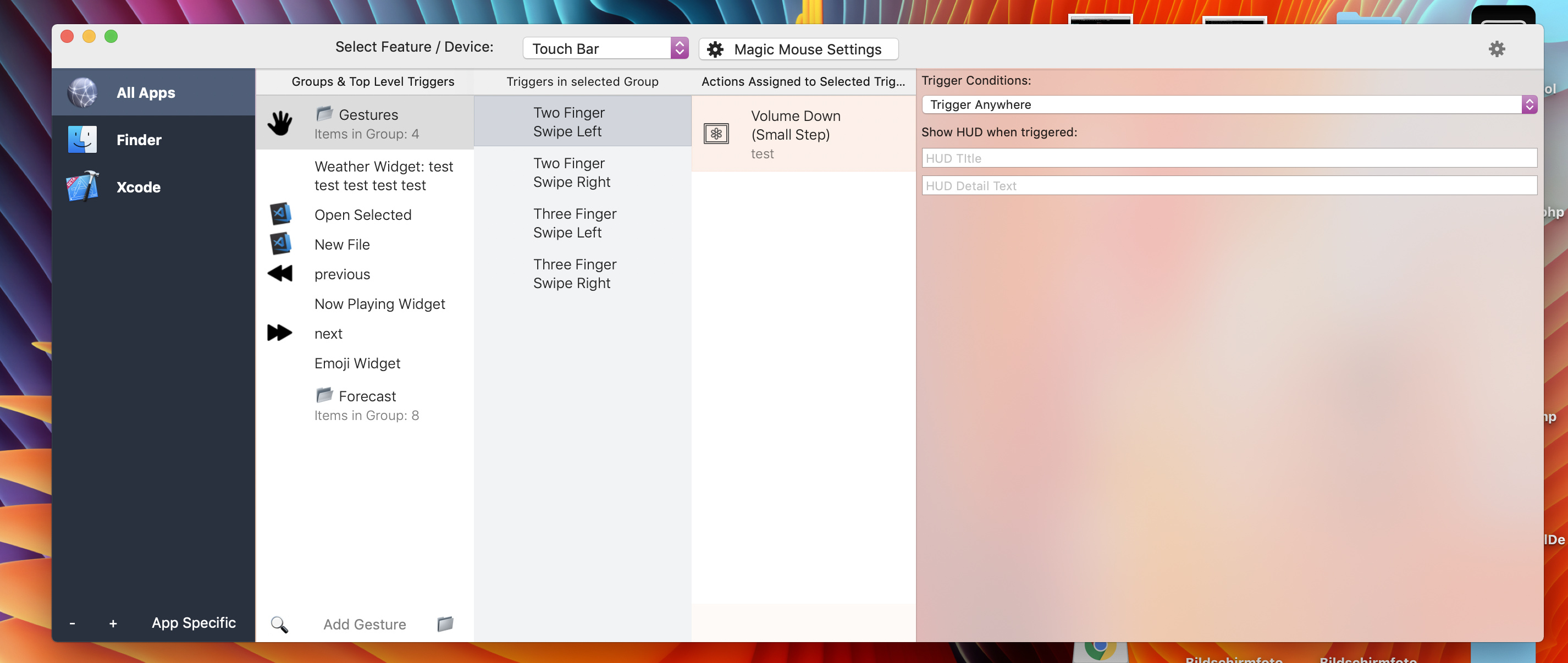
I missed that. I like that change, keep it. Make sure It can display modifiers and things as well. Refer back to the columns in the old tableview

SCREENSHOT COMMENTS:
I liked the full fill for selected app in the leftmost column better. This outline kind of seems out of place...

The general UI touchups look good. e.g. accent lines and the subtle background for the bottom bar. I recommend you centre the traffic light window buttons too.

I miss that nice “iPhone 8 Gold” color in the actious column (it’s background). Bring it back? Let’s make that colour symbolise actions.

Ah we are talking about different triangles, I'll share a screenshot soon! :slight_smile:

Btw.: I have decided to add basic theming options so users will be able to modify the default design and choose what kind of transparency they want :smiley:
I'll soon make a little Twitter poll to see what should be the default

My problem with the dark translucent side bar is that it looks great on the desktop, but it doesn't look good if another window is behind BTT:

In that case I like the solid blue left, and translucent on the right better:

1 Like

it looks more natural and seems alright to me...

Maybe use a darker translucency though?

Staring at the navy, I feel a buisness like feel. That’s all. It looks alright too but the transparency kind of gives me a feeling of freedom (like “I can do anything I want with BTT”) as opposed to (“BTT is for work. Must focus”)
Maybe it’s just me but maybe others can relate

Note: I’m editing my last comment. Sorry for any typos, I’m on a phone

Unfortunately there is only one kind of translucency as far as I know, but I'll do some experiments.