@Andreas_Hegenberg More stuff in the list of stuff. You can move them to completed yourself as I won't know if they're not in the changelog.
@GoldenChaos! Come join me too! You can use your mod power to add to this list
This list will be re-commented every now and then.
Bugs:
Table View: Edits don't save automatically / Cells don't update to reflect edit (was editing trigger names)
TouchBar: Setting the stick to left makes it stick to right. (icon issue)
TouchBar: Setting colours is a nightmare. Keeps resetting or bugging out to illegal colours (i think, because it's acting weird: Shows black in bar, shows 100% transparent in the well, shows a colour value in the picker)
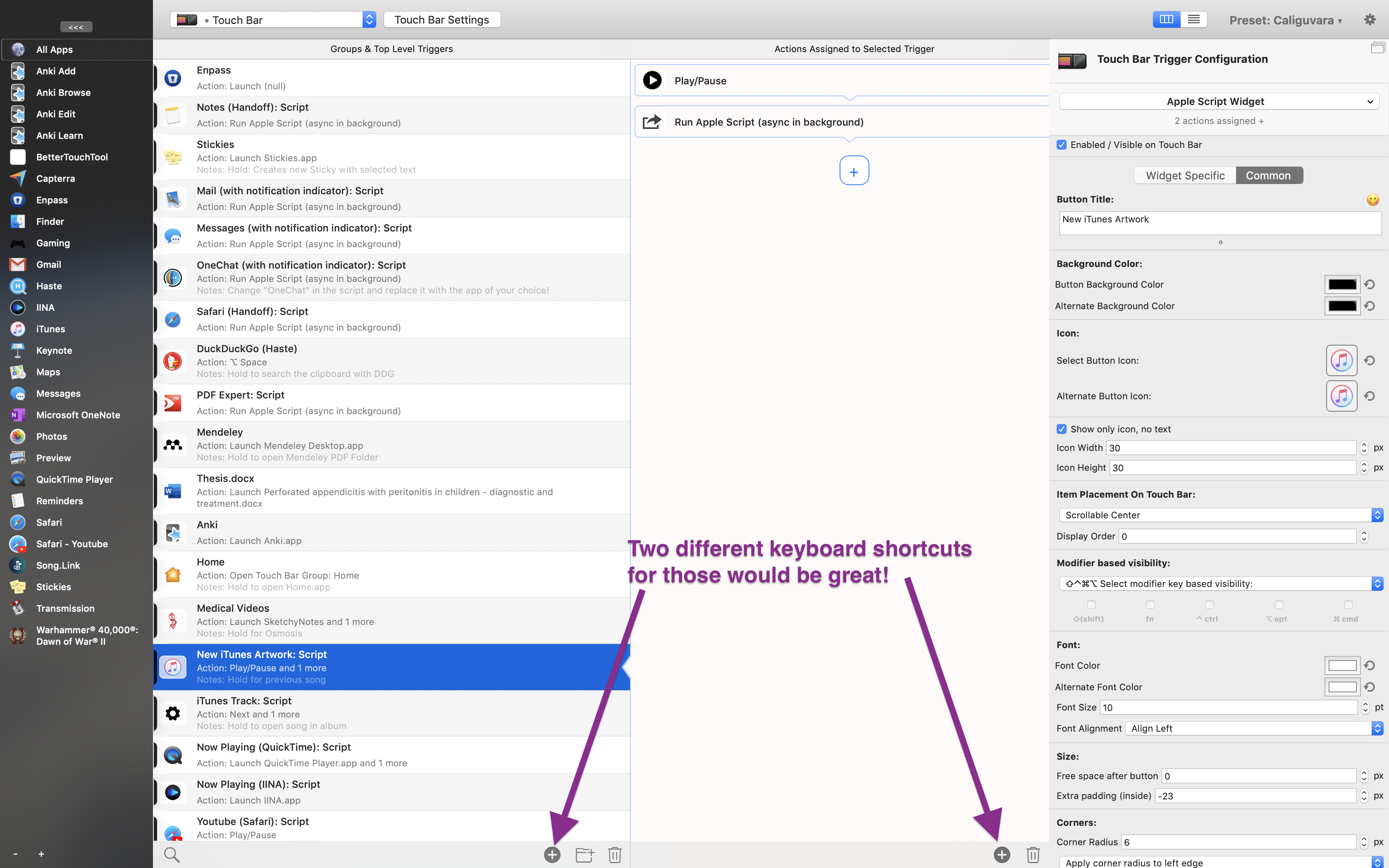
Setting the font color on a multi selection changes the icon size!
Common settings for applescript widgets aren't available for multi selection. May corrupt data here as it shows the normal trigger config.
Corner Radius Picker for Apple script widget looses focus after each character typed in.
Leftmost column doesn't update when a CAG is renamed
Wishlist of small changes:
In the table view, double right arrow doesn't expand the group / actions anymore
More stable ⌘Z. It fails a lot.
Make the selection palettes pop out of the add buttons instead of the config column, it results in less mouse movement
Space doesn't open table view groups
When adding a TouchBar trigger, have the 'normal touch bar button' selected as default so i can just press enter to confirm a normal trigger. Though, I actually think the seperate buttons 'add normal trigger' and 'add widget' was a bit quicker.
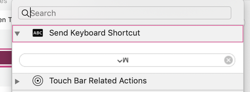
Keyboard Shortcut action should be default for a new regular button.
Arrow keys should always control triggers, and not anything in the config. This would be great for batch editing, e.g. I can press down, leave my mouse where it is and click. and then use tab for the config column.
Keep refining performance
enter to save and refresh (improve)
Handling of multi-trigger edits (improve, all the boxes go blank even if values are the same)
Make hidden triggers more readable
70% ish opacity (refine when you test)
Customisable Colour for hidden triggers
Italic Text 100% opacity
Save Column Sizes across restarts
Refine the - + buttons for activation group column (leftmost). Icons should be used (I gave u + and - icons I think) and the plus '+' should be first (+ -)
Remove the <<< button in the Activation Apps/groups column, replacing it with resizing that column. (Squish it small to icon only)
More Concise Config Column (lowprio)
Speech bubble triangle for actions a biiiit more taller as I can barley see it... Remove the cells' bottom padding to accomodate for that? (and also the top padding for triggers that aren't first on the list so that they touch if possible) (lowprio)
Adding a drop shadow and a fill to these to make them look like a card would also be cool. (ref. my mockup)
Points of Friction:
Adding Multiple Triggers and Setting their action
Moving triggers out from one group to another (column view)
Saving edits is still too finicky to be released
It would also be great if the color picker would stop switching modes, if thats not a system thing...
Not Possible
Space to hide/show triggers (Space is kinda better than ⌘D) (Not Possible, used by default macOS to expand group in table view)
Completed
Grey text for hidden triggers Disable icon inverting in the Activation Group column Magic mouse uses the old icon (you have a duplicate in there, one is a tiff and the new one is a png? You missed a way to access the docs, usage, BTT license / version and news info in the new UI. Try an “info” menubar
All these things aside, multi-editing existing triggers is a joy!
I think I have fixed everything I could reproduce.
Just a few things that won't change:
In the table view, double right arrow doesn't expand the group / actions anymore
Sorry the arrows are used for navigation between the cells. However you can press space to expand.
Make the selection palettes pop out of the add buttons instead of the config column, it results in less mouse movement
Unfortunately that's not easily possible, also I like that the user sees where the configuration resides.
Keyboard Shortcut action should be default for a new regular button.
They kind of are, I can't assign a keyboard action directly, but it should open the dropdown with the keyboard shortcut section open.
Arrow keys should always control triggers, and not anything in the config. This would be great for batch editing, e.g. I can press down, leave my mouse where it is and click. and then use tab for the config column.
Unfortunately that doesn't work well, the up and down keys are heavily integrated into the system frameworks and they are also need to move the text cursor in things like the Apple Script editor. They always control the last active element.
enter to save and refresh (improve)
Enter will not happen in the near future, it causes too many problems. However I'll make more and more items auto-save.
Remove the <<< button in the Activation Apps/groups column, replacing it with resizing that column. (Squish it small to icon only)
Unfortunately that doesn't work well currently, I think it's a bug in Apple's auto-layout system which doesn't like the particular view setup. Maybe in the future.
Adding a drop shadow and a fill to these to make them look like a card would also be cool. (ref. my mockup)
I don't like drop shadows here, especially because they are used nowhere else in the UI I think they will fit even less with the next macOS version that brings all the iOS app to macOS.
The rest of the list is either already fixed or will be in the future (but possibly not before the 3.00 release).
On the color picker issue, would it be possible to define a color theme for the preset of an arbitrary amount of colors (say 16) and then have those pop up when choosing a color with an option to set another color. That way, users can have a predefined palette and there will be more consistency across the theme? This would be akin to what PowerPoint and Google Slides do.
yes something like this would be great. (defining colors for the preset)
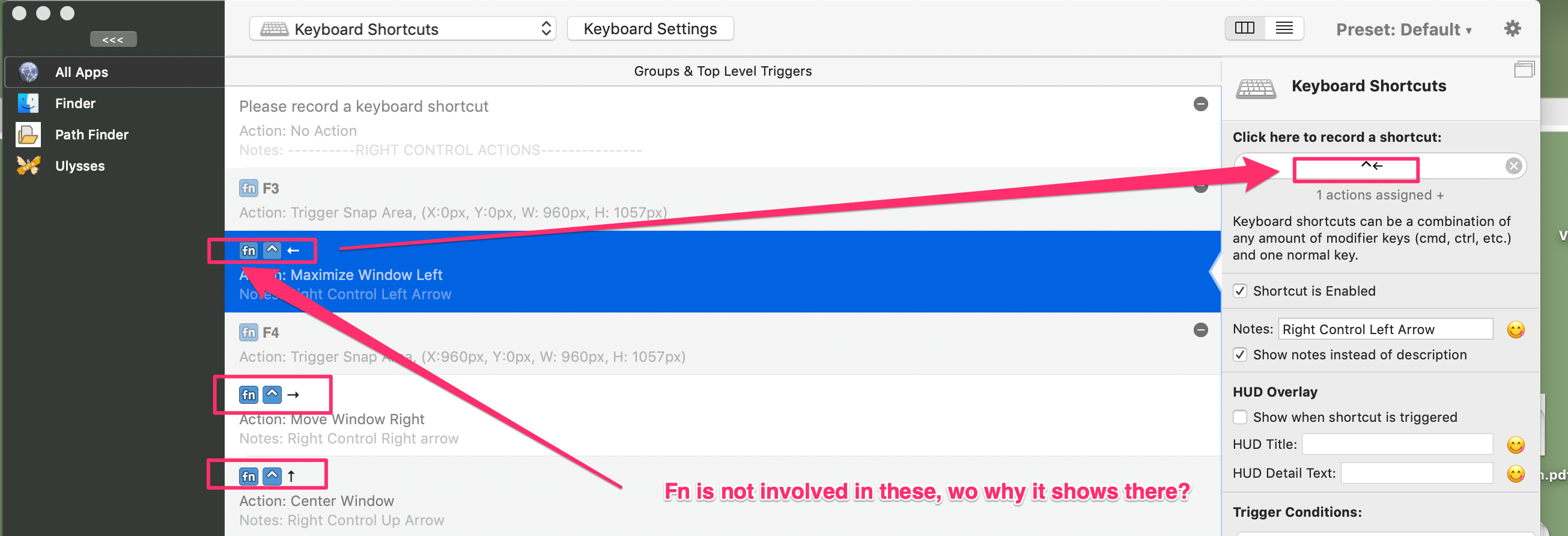
@manuelescolano good point, some keys like arrow or F keys always come with FN, but they are pressing it automatically. I'll hide it from the UI as that's not relevant for users.
New version has crashed on me 4 times while working in Apple script window. Will see if I can reproduce, I do know each time it can be minutes after I run the Compile/Test.
I also added a hidden option for now to hide the default colors in the picker: defaults write com.hegenberg.BetterTouchTool BTTDisableDefaultColors YES


 In the table view, double right arrow doesn't expand the group / actions anymore
 enter to save and refresh (improve)
 Make hidden triggers more readable
 Grey text for hidden triggers


 Maybe because all color pickers I know have the defaults on top and recents/favorites on the bottom. But I'll play with it.