Hi,
I finally got into making a floating menu. I created the menu and have multiple questions:
For example, is it possible to hover over some buttons to open the submenu, like on the HTML menu?
Or can you change the icon color on hover?
But for now, I wanted to have my own icons for some buttons, but whatever I do, the icons are always pixelated. What are the requirements for the icons to show like the other icons from the SF-Symbols collection?
Here, you can see that the Notion icon is pixelated, and it doesn't matter if the icon is in SVG or PNG.
Thanks
for retina screens just make sure to export the png in twice of what you set the size in BTT.
So if you set the icon size to 50x50 it shoulf be exported as 100x100
There are no other requirements 
Thanks Andreas,
That solved it. And if you select an SVG file, it seems to work even better.
Great!
Btw. hover options & actions are coming with one of the next alphas.
1 Like
Ah, cool. That is nice.
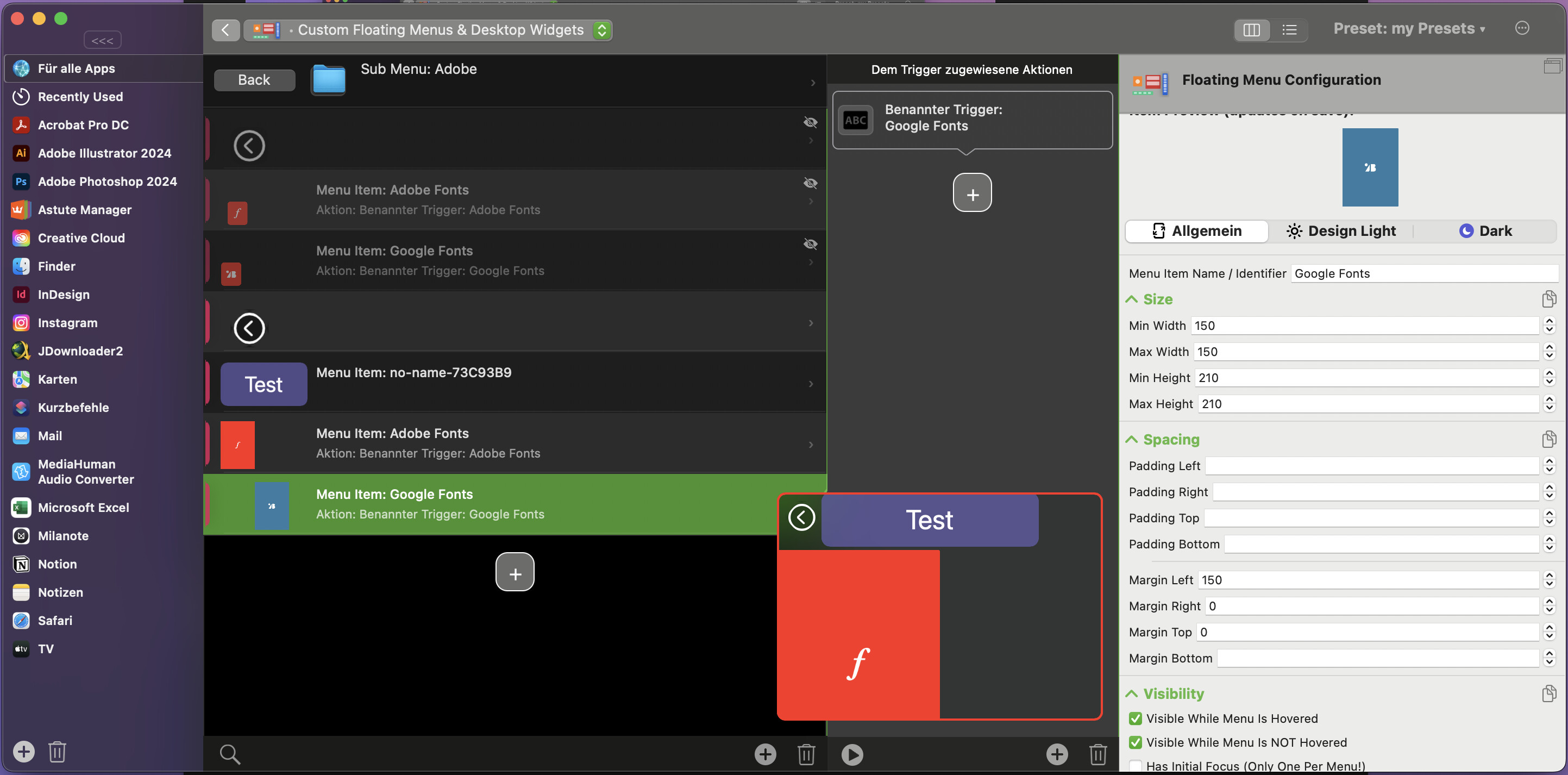
I have one more question. I would like to have an option to have two buttons side by side on the submenus and the back button above them. Is this possible?
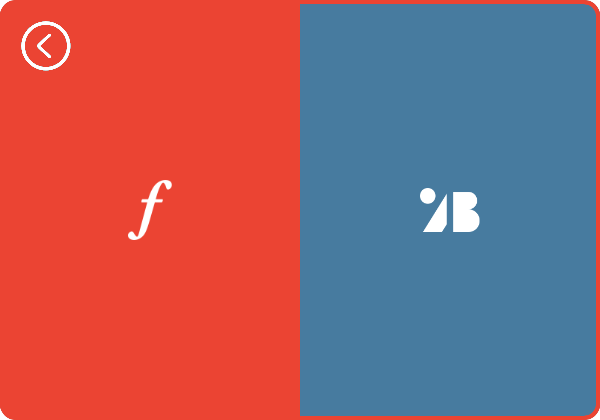
In this example, I have two rectangles in red and blue and want them side by side, or if there are four rectangles, one in each quarter of the main one. And then the back button should always be in the left corner. Is this possible?
Ps. Is this a feature that the fill color is changing on the hover, a normal behavior? I don't know why, but sometimes this happens, and sometimes it's not. Is this a feature or a bug?
Thanks again
Currently you'd need to add an invisible button after the back button that fills the space to the right forcing a line break. In the future it will be possible to have element-groups with different layout options, then this will become easier.
The hover thing might be because submenus currently use the style of the "button" that triggered them. I'll soon add a way to disable this behavior and instead default to the top level style.
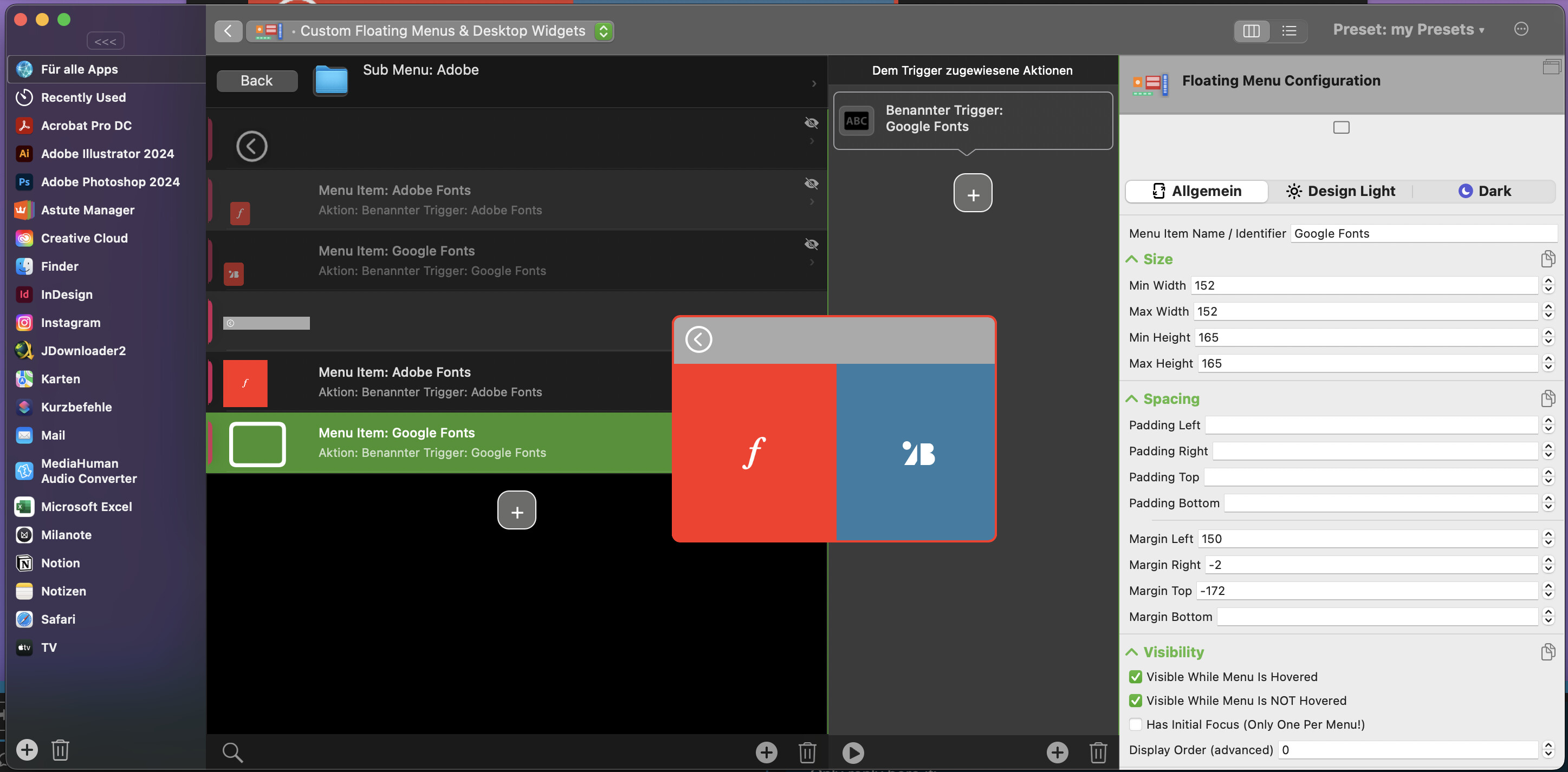
Did you mean something like that? That doesn't do what I wanted, but I could go with it if both buttons were visible. I do not understand why the blue rectangle is not showing up.
Actually, I would like to have something like this, but I think it is not possible, or is it?
Currently the corner radius is applied to all corners, thus this won't be possible yet. I have already implemented specifying the corners that shall be rounded, it will be available soon.
Your blue button is probably pushed down because it doesn't fit (maybe the width including border/margin is a little too big)
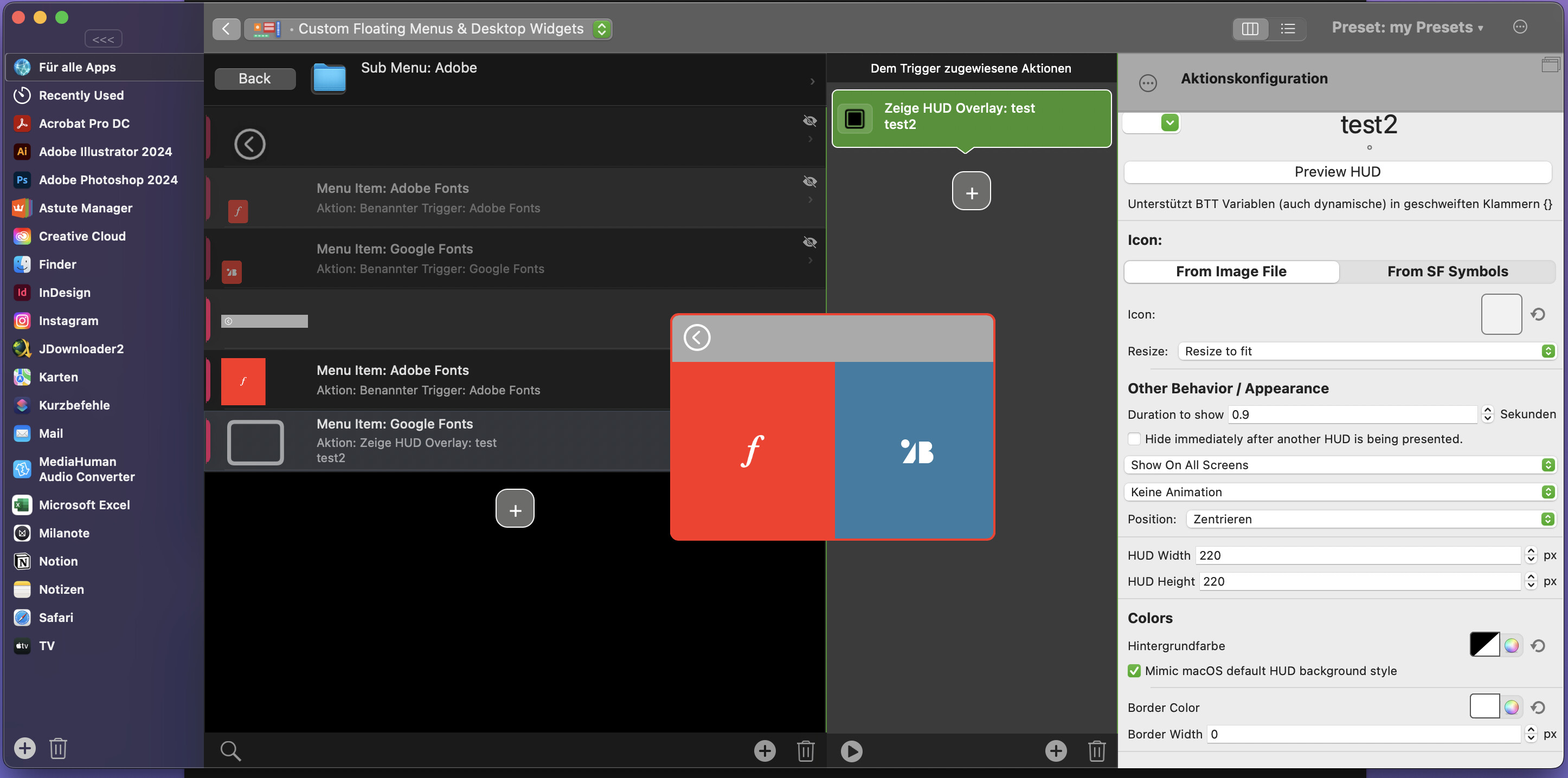
Ok, I managed to get it to this state, but whatever I do, I can not click on the blue square. When I do, nothing happens. 
have you tried attaching some other action like „show hud“ to see whether it triggers?
Yeah, just did it. And, nothing.
could you copy & paste the problematic submenu here? (or export the whole menu via right-click -> export selected to file)
Ah the problem is the use of these large negative margins. I'm not sure why this even renders correctly 
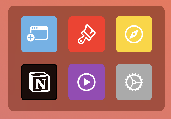
Here is a little example that seems to work ok here:
exported_triggers3.bttpreset (1.1 MB)
1 Like
Oh ok. To be honest, I thought I had to do it this way to get the results I wanted.
But with your version, it seems to be working now.
I'm also looking forward to the next updates for the Floating menu because I want to replace my HTML menu completely since the floating menu is much easier to customize.
Thanks again
Hey Andreas,
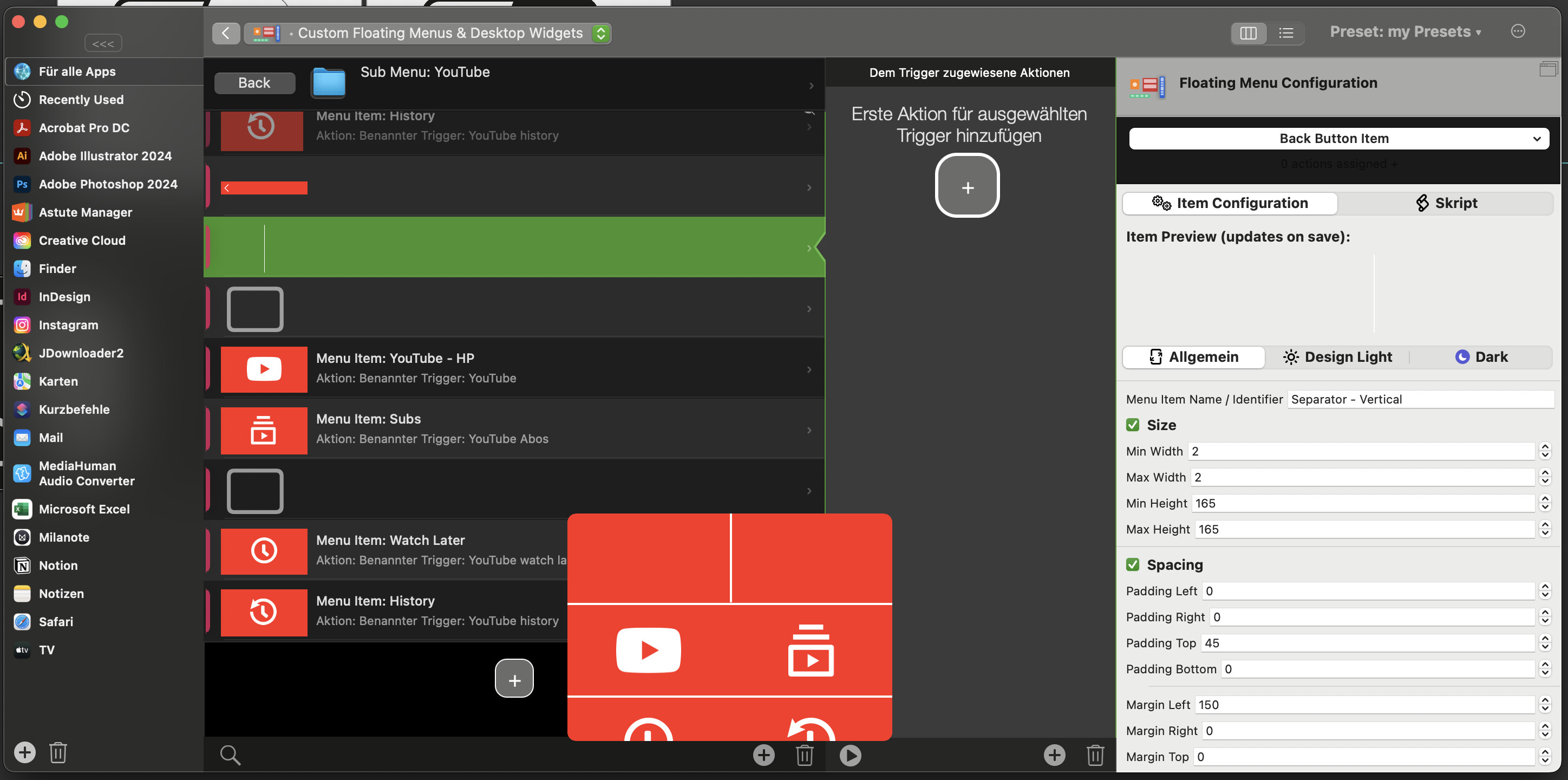
Now I set everything up, and it works how it should, but the more I look at it, the more I think I would like to have some kind of dividers. But it looks like you can not put elements on top of each other. I've already created some lines, but I don't know how to tell the vertical line to move down on top of all the buttons.
If there is a way, that would be nice, but if not, that's also okay with me. I will wait for the next updates.

Couldn't you just have some spacing between your buttons? Or a small (1-2px) item inbetween?
I could make my buttons smaller, but because the color of the submenu icon also dictates the background color, that won't work. Because then the red background would show up. If the background could be transparent or white, that would work.
And that is what I did. Those lines are basically regular empty buttons resized in 2px thicknesses. But because of the stacking order, I can not make it work.
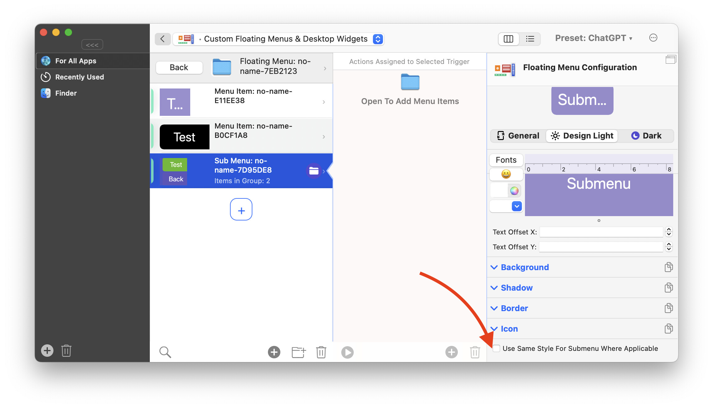
I'm not sure whether it will help in your case, but 4.444 alpha now defaults to the main menu style instead of using the sub-menu-item's style for new menus.
For existing menus you need to toggle this checkbox on and off again to get that new behavior:
This alpha also add options to define which corners of an items will be rounded.
I usually try not to use the alpha or beta version of an app, because of the stability, but maybe I try it out.
Can I go back to the stable version if something goes wrong?
Is it stable to just update to the alpha? Or should I wait for the public release?