Describe the bug
The newest update to the beta Notch Bar feature seems to have done away with the option to show the native macOS status items. If this is needed to make it work properly, it's totally on me for using a beta feature and relying on certain things working like they did, but:
Not being able to use the "real" status bar on the right breaks a handful of things, so far the most annoying ones are
- Losing the ability to click bar on the right side of the notch to open Bartender ("Clicking on the menu bar will show/hide menu bar items" worked previously)
- MeetingBar doesn't really work without the native status bar
- The update rate of the BTT status bar (even set to 1sec/a low number) makes displaying seconds on the OS clock pretty ugly/extremely distracting (it skips irregularly in multi-second increments)
If it's possible to have the option of enabling the native status bar back, that would be good. If not, I will find ways to live with it :b, still a solid upgrade to the standard bar... but I did prefer doing stuff mainly on the left side of the notch and letting the OS/other apps use the right as needed.
BTT version: 3.898
The system icons should still work if you are not on macOS Ventura (13.0) yet. On Ventura Apple unfortunately removed the ability to show them.
However the setup changed a bit in the latest version:
You now need to add the "System Status Icons" widget. BTT should automatically add that, but maybe something went wrong during migration.
I also fixed some more things in 3.899.
On Ventura I would recommend to replace the default clock with the BTT date/time widget, which updates continously, but I'll also make it update once per second with the next alpha.
I'm on 12.6 still, I meant that (unless I am insane here) there was a checkbox to show/hide the real macOS status bar on the right that went away with a recent BTT update. Is showing the native bar still possible, or am I misunderstanding?
Looking at it again, the (only macOS < 13.0) widget actually doesn't show up at all for me, "BTTNotchBarRightOfNotch" has no content in its children when I put it in both groups, so something else might not be quite right)? 
But I take that to mean that stuff like MeetingBar and Bartender that interact with the bar will not necessarily work out of the box on the right half as easily as it was? Absolutely a minor issue in the end, just spoiled by how it was working 
EDIT:
Come to think of it, I was also unchecking the boxes for the right two zones, that entire system seems to have gone away now.
The native status items should still show if the "System Status Icons" widget is added and active.
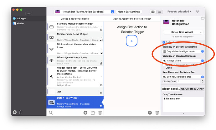
It's ok for the macOS < 13 widget to not show up in the DOM, because it's not part of the HTML. Instead it should be overlaid by the system over the Notch Bar. Could you post a screenshot of how the configuration for the "System Status Icons (Only on macOS < 13)" widget looks like on your system (in the BTT preferences)?
Correct, this has been replaced by these dropdowns on a per trigger basis:
Oh! I had it as "Always visible", and that seems to make it just not show up at all ever. Setting it to one of the "only"s restores previous functionality! (... should have found that myself, really)
It also doesn't seem to respect the "enabled"-checkbox without a full BTT restart, which I wasn't thinking about when testing.
Few notes there, but thanks for the help!
Thanks for reporting, I'll fix these!
1 Like
Just a super quick feedback note on the default layout, without making an entire thread for it 
(if not default, maybe as a quick option? Might be technical blockers I don't know of)
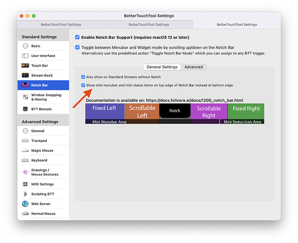
I feel like having the app menu items be on the screen edge makes a bit more sense for the mini-mode, with regards to UX. A big benefit of/reason for the original ones being on a screen edge vs on the app is that you can "throw" your cursor without needing to stop and accurately land on the buttons, it's a small but pretty noticeable QOL change to move them to the edge, especially when they get even smaller.
Easy CSS fix for myself, but if it wasn't an active choice to put them where they default to I'll throw my 5 cents at this.

Great idea, I never thought about this but you are absolutely right.
1 Like
I have added this as an option for now (3.900 alpha):
2 Likes
Version 3.904, System Status Icons seem to be show as well as Notch Bar Status Items widgets. Note that System Status Items are NOT enabled.
I have been keeping the Alpha stream updated daily and this issue appears to have crept in to 3.904...
Oh, I see it - need to change Visibility on Standard Screens to be Only visible in widget mode - guess I just got lucky the last few days!
Are you sure there is no "system status icons (macOS <= 13.0)" widget? It might have been added automatically. If you do not need the system status icons, try to set the visibility to hidden for it.
If so, could you go to Help => Export Diagnostic Debug Information and send the result to me? (andreas@folivora.ai).
It's currently a kind of complicated situation because Apple changed many things in the upcoming macOS Ventura and I need to keep everything compatible on all versions.
1 Like
Sorry Andreas I got distracted and see that I hadn't saved my edit. It's all looking fabulous again.
Edit 1:
"system status icons (macOS <= 13.0)" (ssi) is disabled.
"Notch Bar Status Items Widget" Enabled, and "Only visible in widget mode" - If I change that to "Always Visible" then I get the doubling up - as if ssi is enabled!
Edit 2:
I went ahead and enabled ssi, setting "Standard screen to be hidden" and its looking fabulous.
Didn't want to make a new thread because this is along the same lines I think.
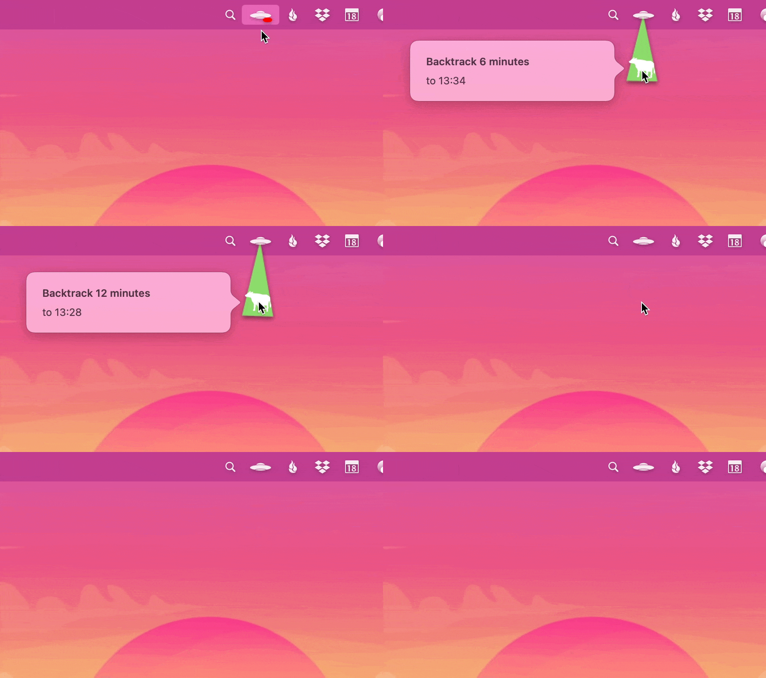
@andreas there are some menu bar status icons that I think need to be native to work. I think you mentioned this was a Ventura thing. But, for instance, I run an app called Backtrack. It's great. It allows me to buffer audio and capture if it I need it after. However the UI is a clever little string you pull down.

I take it there's no way to enable native menubar icons on the right but BTT menu items widget on left?
correct unfortunately macOS Ventura made that impossible as far as I know ;-(
One thing that I could allow to make the BTT bar only half width, however you’d be able to see the „split“ visually
Hmm. How so? The notch pretty much prevents anything from crossing over.
I think that'd be pretty useful because right now I have to decide between menu status icon functionality or the notch bar.
I do love the miniature status icons though; i only wish that having them mini allowed for more but it seems to hide just as many as it would need to if it were bumping into the notch.
In v4.027 alpha I have added a slider to the settings that allows you to change the width of the bar, maybe experiment with whether that helps you.
Maybe it would make sense to allow different widths for the different notch bar modes.
Feedback it is it works perfectly.
I can't see any change. The left half is BTT, the right half is regular.
@Andreas I LOVE the notch bar in concept. In reality I can't get it to work for me without glitches and weird things that are very probably to do with Apple's walled garden.
I've come to the conclusion that the best implementation of the notch bar, for me, is going to be something I can dock to one side of the screen and have come out when I want it.
I know you were looking into this and I was wondering how far along you've come.
Perhaps I could run one of those utilities that mimics the TouchBar and then send my notch bar buttons onto the touch bar? Would that work?
It's so frustrating because it's so useful but I can't get it to work for me.
I wish there were a portable strip of oled buttons that I could put between my function keys and the intake fan (see https://www.freeyourstream.com/ )
Anyway. I was hoping you'd perhaps got an alpha implementation so I can use the buttons but have them not interfering with my menubar.
All best.
