How about putting the Color Picker in the bottom half of this window? Make it resizable (Up/Down). So now you have two panels/windows in that same large middle section. IM going to say PLEASE....
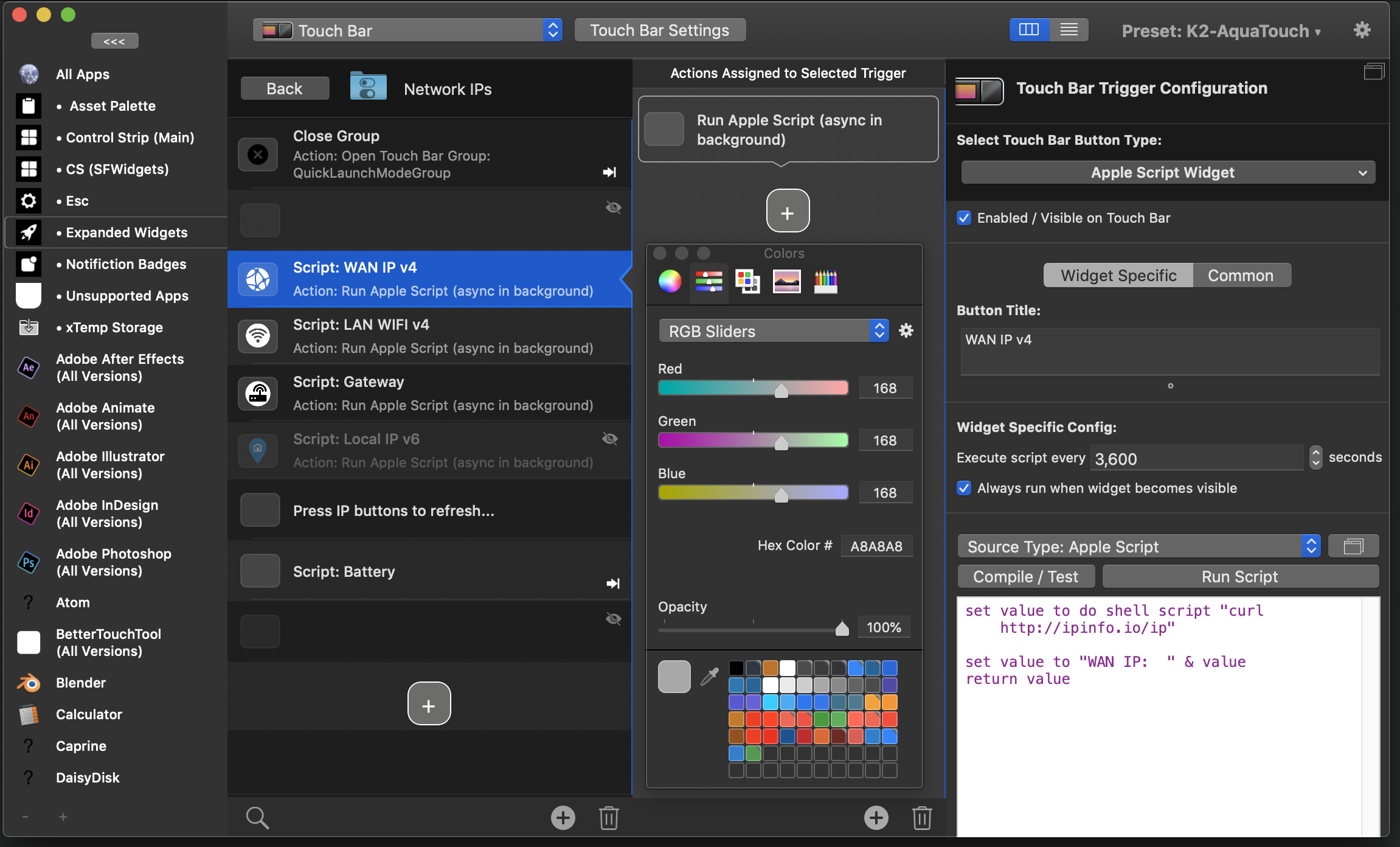
Im trying to exclusively utilized the new UI to help you with testing. I find the Actions Assigned to Selected Trigger (PANEL/WINDOW) to be the most UNDER utilized panel and often just has a single asset in such a large panel. would be nice to utilize this panel better, right?
If possible add such ideas here: https://community.folivora.ai/t/new-bettertouchtool-ui-progress/
There are some long term plans for the actions column (e.g. splitting it for normal vs long-press actions), but for now I don't think it's a good idea to add more stuff in there. I like that it's pretty clean by default but for the first time can show action sequences appropriately.

I understand your position... But I would love to see this feature. It could be pinned/unpinned for those that need that extra space in this view. For me, it just makes total sense since color is such an integral part of this application.
Just a fun one, but here's the tip I gave andreas a while ago if you weren't aware of it!
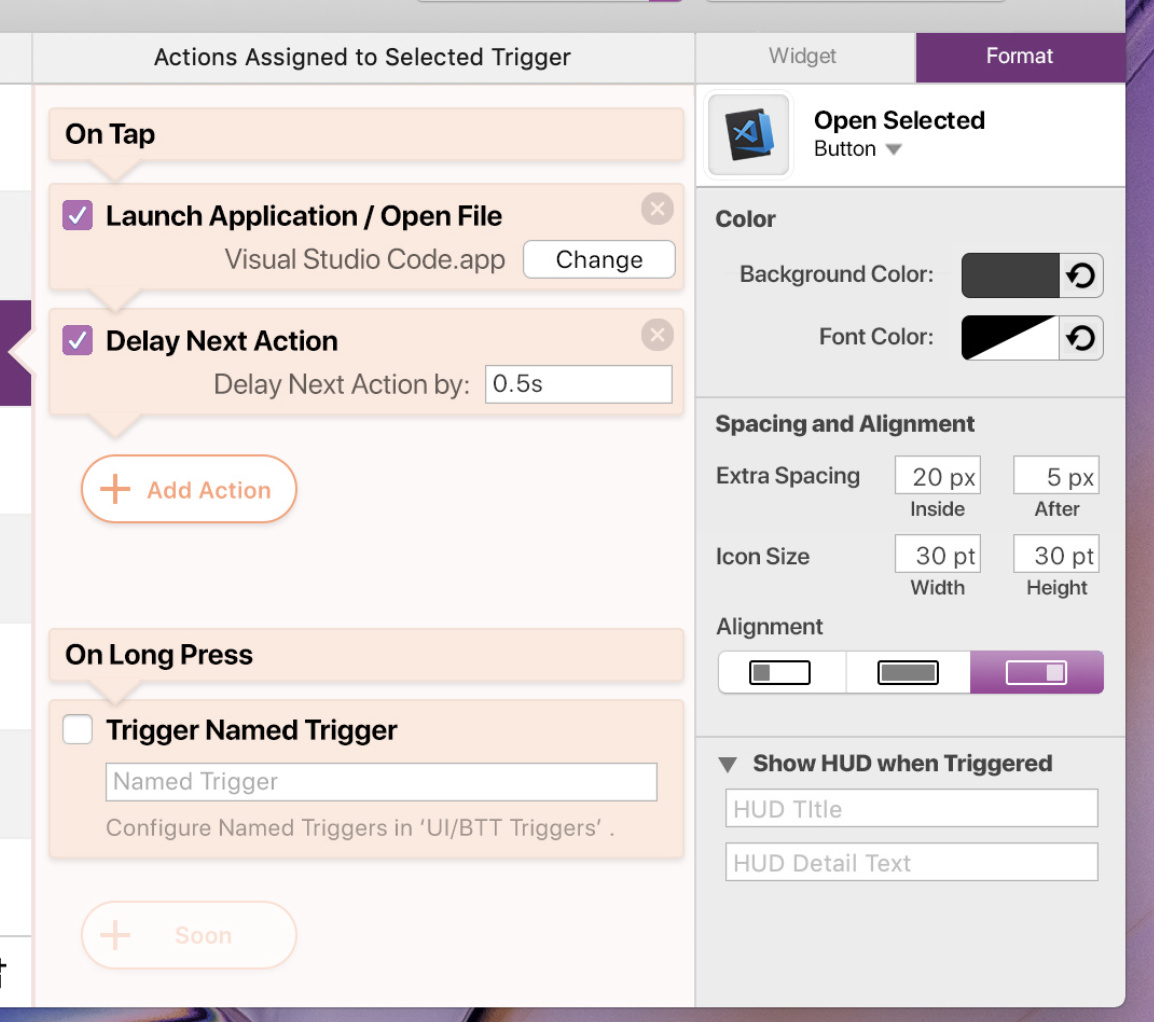
I’m assuming that’s your mock-up and not some more intuitive older version?
Would enjoy a more condensed bar with items grouped so those fast edits can be done. Less scrolling would be heavenly.
Yes a mockup. Older, more intuitive version :? lol. Andreas is somewhat using it as something to work towards I guess.
I'd prefer scrolling over clicking and adjusting myself to the new layout that just popped up in the last column, but I don't think overflow will be an issue with that design as not many triggers have ten actions assigned, won't they?
He's talking about scrolling in the right configuration column 
(Which will eventually become a little bit more compact after I have implemented side-by-side textfields and collapsible sections, however these are on my "longer term todolist" and will most likely follow after v3.00 has been released)