@Shnub
Yes, that was what I did in the original mockup, but @Andreas_Hegenberg said that this would require a significant change to the data model and is hard to implement. (very understandable) This is why you can see a “+ Soon” faded button below it as I adapted the design to accomodate the current limitations!
Uhhh finally finished the localizability "project" to make the new UI adapt correctly to different sized strings and translated more than 13000 strings to German. Already ordered translations for Japanese, Chinese, French and Spanish that should be delivered in a few days. If that works well I'll order more languages - feel free to post requests in this thread: Request other translations here
jup for now it was just important to migrate the old settings to the new format. Making it look nice and adding features like search will come over time!
@yuuiko just added (kind of) your triangles and "speech bubble" actions
The indicator triangle is really helpful (although it was hell to hack a table view to do this, your exact design would require even more hacks, so that's it for now).
Just been using the new UI for some legit AquaTouch trigger formatting and i've gotta say it's working... okay.
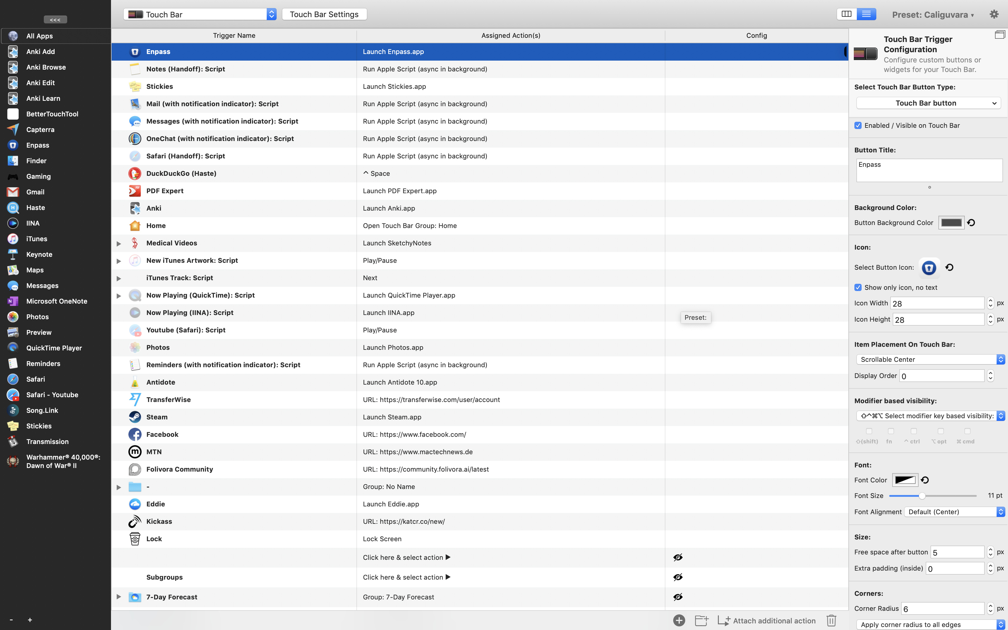
I've been using the column view and it seems to be somewhat easier to navigate when compared to the old UI, but present everywhere are lots of small tiny little bugs that build to be a bit annoying... Here's a quick list of some gripes:
Moving the mouse up to hit save in order to see changes in the columns got very tiring... the Auto-save would be great!
Unable to rename triggers within the cell. More mouse motion to rename
Lots of times changes didn't save and I had to re-do whatever I did to convince BTT to save it as if it was stubborn
Some stability issues with the image drop area, sometimes the icon will go behind the drop image then it'll get lost and I'd need to redo that change
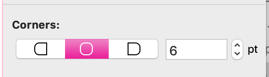
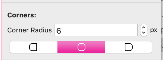
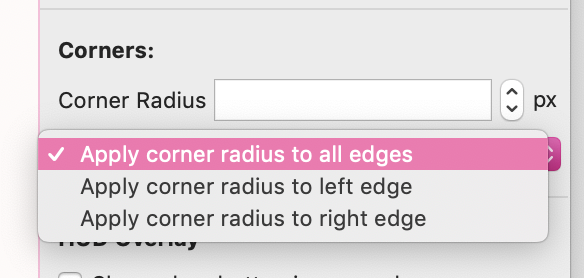
The 'rounded corners on left/right only' never saved if it was set by itself, i always needed to restate the round px to save
Lots of things are stuck with the default values inserted, or are empty.
The config panel doesn't visualise 'multiple values' that well if more than one trigger is selected. I think apple does a grey italic value
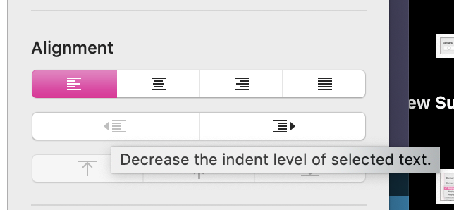
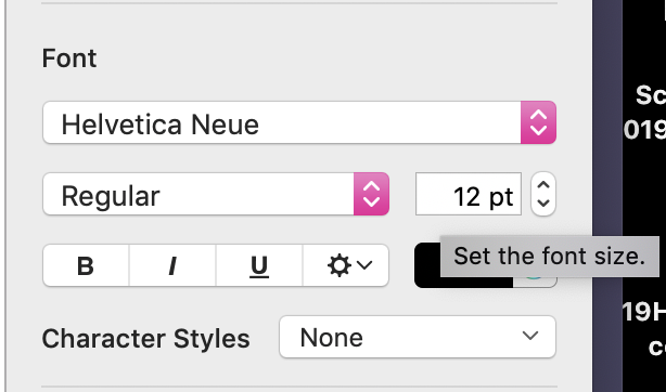
I always had to squint, scroll up and down and pause to find the right setting in the last column. Making this more concise with less popups would be great, e.g:
Edit: You could probably go one step further like:
Instead of:
This would also reduce clicks, mouse movement and reading for the right option.
such bugs are definitely expected as I have been the only one really using it so far. They will be fixed very quickly as soon as I finally do a first real release (waiting for my Chinese and Japanese translations, should arrive very soon)
About the save: do you know you can just hit cmd+s?
For renaming buttons you also shouldn't need to move the mouse - double clicking or hitting enter will focus the name field in the side-bar (unless there is a bug with that). In-cell stuff however won't be possible, everything will go through the side-bar.
Huge bug that makes it really annoying to edit anything inside a widget group: the "show inside any Touch Bar group" setting unsets itself if you don't check it every time when editing a widget.
I don't totally understand why the "Save" functionality exists? I like it just auto-saving as I edit, which it seems to still do anyway. I think the extra "Save" bit is very confusing and unnecessary.
jup the save is currently there for technical/compatibility reasons, but I will probably be able to get rid of it soon in most cases. It already saves when switching to a different trigger and for various things where it can be done automatically
The show inside widget group fix will be in the next alpha
Yep! I never expected it to be perfect on the first run, for sure they’ll be lots of little hitches here and there. I was trying to bring forward a few things that would make BTT better rather than rant about it if that wasn’t clear!
Moving forward I think the main focus should be neatening up the config column to make it more concise. (then moving action config to the cells would be good but well the current is usable enough) (then again, I’m not sure what you’re busy with so consider this a suggestion)
Edit:
I realised that in pages a lot of the description is moved into tooltips, I think this is a great way to keep it concise for familiar users but descriptive for new users
Wishlist of small changes:
Space to hide/show triggers
→ Grey text for hidden triggers
enter to save and refresh
More stable ⌘Z
Disable icon inverting in the Activation Group column... Maybe add an invert icon checkbox or something as it's not doing it very well automatically (BTT's own icon is blanked out too lol) It doesn't change background in dark mode so I don't see why it would need to dynamically decide this.
Magic mouse uses the old icon (you have a duplicate in there, one is a tiff and the new one is a png?
In the table view, double right arrow doesn't expand the group / actions anymore
You missed a way to access the docs, usage, BTT license / version and news info in the new UI
Speech bubble triangle for actions a biiiit more taller as I can barley see it... Remove the cells' bottom padding to accomodate for that? (and also the top padding for triggers that aren't first on the list so that they touch if possible)
Thanks for adding the notes column!
Perhaps you might consider removing the text that says "Notes: " on every note - it feels redundant. Also, considering that we can't change the width of any of the columns in table mode yet, that "Notes: " is taking up valuable screen real estate and making many of my triggers take up two lines instead of one, all because my note text is a character or three too long.
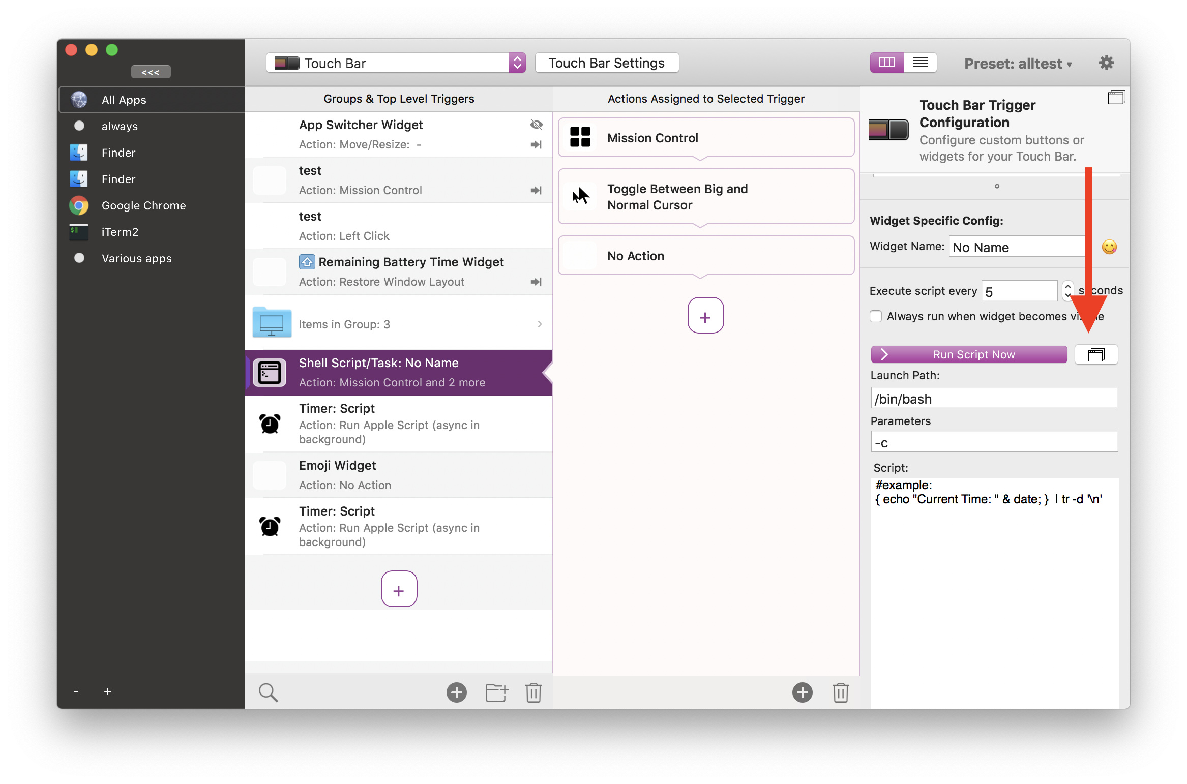
Does this apply to other editors; Python, bash & wotnot? I've just looked at this new UI for the first time, the narrow width of the script editor makes it unworkable for me.
I think you might not be on the latest alpha (2.763), it should display the notes in the config column. I'm working to re-enable the resizing of the config column, but there is a macOS bug that breaks some layouting when enabling resize....


 such bugs are definitely expected as I have been the only one really using it so far. They will be fixed very quickly as soon as I finally do a first real release (waiting for my Chinese and Japanese translations, should arrive very soon)