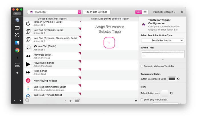
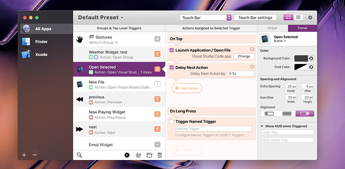
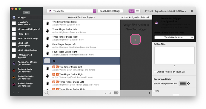
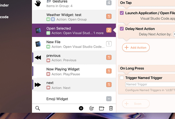
Very nice 
Aw man, any chance this could still appear in the future? I was super hyped to add a new modifier menu.
I'm not sure, the (touch bar) system doesn't seem to handle the FN key like the other keys unfortunately. Sometimes it works to override the system behavior, sometimes it doesn't...
Quick update for v2.734
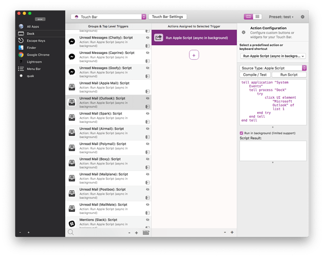
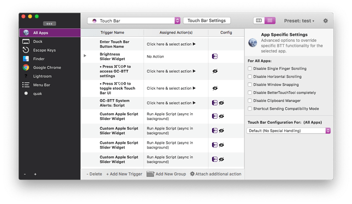
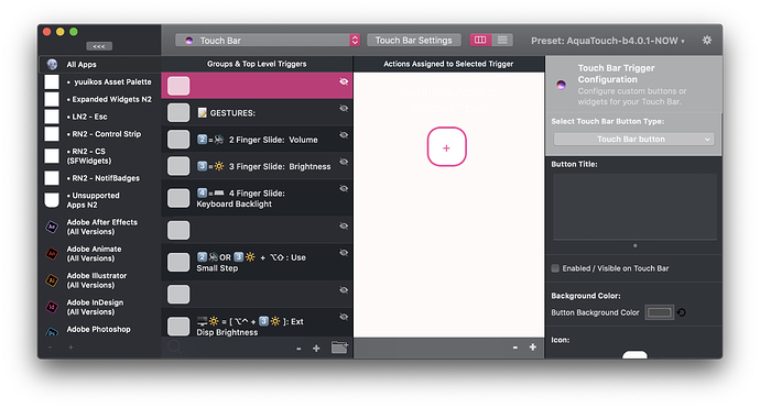
- Added "Active App Simulation". This can be activated via View => "Emulate selected app as active". If this is enabled, BTT will e.g. show the Touch Bar as if the selected app or CAG was active. Multiple CAGs can be activated by pressing cmd when clicking on them.
- Various little style improvements
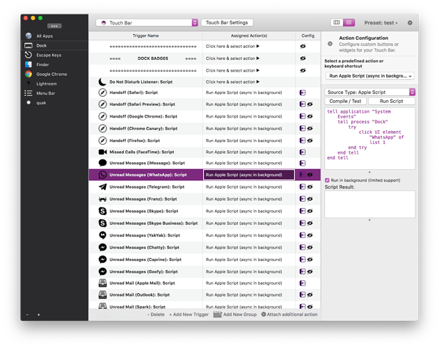
- First working implementation of list style view. Drag and Drop support and multi-selection support will be added tomorrow.
Will be online in a few minutes.
I was hoping for something like this, but didn't expect this to come 
Wanted this so badly, this is great! Thank you
"UI update" 
v2.734: Feedback
Fixed 2.754
Missing Toggles
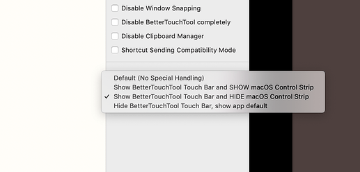
Missing Show macOS Touchbar, HideCS
I see that you're working on the hide/show trigger, as you've added the indicator. But it still isn't possible to hide/show triggers!
Groups:
hmmm the slide-in groups aren't really good... I got confused a bit till I realised I had to double click. I think the old splitting menu would be better if it was refined.
Colour Palette Cleanup
Orange, Navy, Cherry, Blue (or whatever system colour it is)
Grey and Vibrant, rounded and square
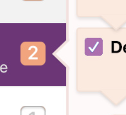
All these inconsistencies increase confusion. Try to harmonise each column a bit more. Having a pallete for each column (e.g. orange for the actions) as you have now is a good idea, as you can communicate that "Everything that is orange relates to Actions" (as seen in my mockup, you can see that in the action count - show/hide checkbox). Just refine the colours a bit more so that it's a bit more evident.
EDIT: Table View
Whoa this looks great!
Seems good so far. The only things I can say right now:
-
Improve the 'currently selected' highlight. Try a thick box with a margin like finder instead as the thin, white fill makes it a bit hard to see. Try a black outline too
-
Would be good if arrow keys Control the currently selected cell instead of the row, eliminating the need to click into them.
Groups:
Currently I think it's hard to see relationships between the views. It's hard to have a glance and know what controls what. I'm not sure if you're up to the 'refining' step as you might still be just trying to get all the functions in, but I recommend you take a step back and have a look at it's general flow.
Starting Window Size
Just a small one, but I think the rightmost column with all the settings should be a bit wider, and the window in general a bit taller.
Alternating Row Shading
yeeeaahh, it'll be good to have that.Refined Cell Icons / Organisation
Try not to clutter the title. It should be easily recognised. The icons could be more consistent and less contrasting too but that can come later.
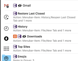
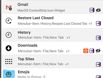
I'm not sure about the icon placement in that mockup, i prefer the one in my full mockup above but i do agree with the removal of "Action: " and "and 1 more"
Do notice that the text is truncated if it flows over one line in my mockup. "Open Visual Stud... 1 more"
Add those triangles to allow people to know that "this panel controls that"
Don't confuse action configuration with trigger configuration.
It may be hard to implement, but those 'action modules' are much more understandable with more direct, connected options. Changing a whole column just for 'delay time' seems unnecessary. Doing it this way would also mean you don't need to click in and out between triggers and actions to modify them.
@GoldenChaos, your opinion too? you're a heavy user also.
@Andreas_Hegenberg I hope this feedback is useful to you! Sorry in advance if it felt ranty or demanding, my intentions here aren't to rant or demand but to help you refine the new UI for all to use ![]()
Feedback is always very welcome!
Missing Toggles:
Yup I'll go through the various options before release and add missing stuff!
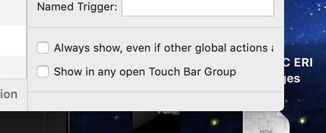
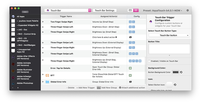
Currently I plan to have all toggles in the side bar - there you can also find the visibility toggle for Touch Bar buttons:
Groups
I have worked quite a while with the old splitting mode and tried all kind of different resizing options. It always stayed confusing no matter what  On the other hand after working a few days with the new sliding groups I love them
  . I think they will stay for release (but may change in the future if I have collected more external feedback).
Don't confuse action configuration with trigger configuration.
I'm not sure what you mean by that - do you have an example? I need to separate trigger and action config, imho mixing them would be bad.
Add those triangles to allow people to know that "this panel controls that"
I haven't decided how I feel about these yet. I might try them before release though.
I feel that it's already pretty clear that a selected cell will control the next column. (Just like e.g. in Notes or Messages)
Colour Palette Cleanup
Yep - color cleanup will definitely be done before release! They are currently just kind of random 
** Starting Window Size**
Final version will remember the last sized used.
Alternating Row Shading
Yes I think I'll at least make shading an option. However I think I'll only enable it for the left column as it feels a bit overwhelming if added to the actions column also
In general I plan to have various options like this in the new settings (which I'll finish next week) - then get some statistics about which options are being activated by users.
Refined Cell Icons / Organisation
Yep, still experimenting here! Also the current icons where just my "placeholders". I plan to spend a day creating better ones before release.
Table View
I agree 
Table Views are not really made for cell selection, thus I'm still working on that (keyboard navigation etc.).
In general I think the column mode is great for beginners (I have already received quite a few overwhelmingly positive mails from users who tried the alpha). The list view is better for power users because it is easier to read if you have many triggers & actions.
Glad to see you've got most of this sorted! I agree with most of your replies.
Here's what I meant with not confusing the columns:
The Rightmost Column (let's call that the Config column) will never show actions, only trigger config.
The Actions in the actions column won't open up in the config column, instead it'll have its options inside its cell/row. See the mockup images, siri shortcuts or automator for example.
Therefore: There will essentially be only three columns. 1st: Activation Groups, 2nd: Triggers, 3rd: Actions and Config (split in two). Or you could say that the actions and Config Column will always open together.
Because of this, we wouldn't need to click an action to edit it anymore, we can simply directly edit it's preferences within it's cell, and even lets us glance at what it's set to more easily. (since you don't need to open it up to see it in the config column)
It also makes the config column easier and less confusing, it'll not focus on anything related to actions, but only triggers and interactions.
This may be hard to implement, but I'm pretty sure it'll simplify the usage a lot and open up to more trigger types especially for touchbar. (e.g. on long press, on flick trigger, on two finger tap, etc.)
While I updated that mockup... (added the table view switcher and the "add widget" icon) I came up with a new idea for your 'preset color triangles' :
Seems neater than the triangles, more streamlined and minimal, and you can make them do this when you mouseover them:
Fun fact:
The background color for the actions column in my mockups is derived from the iPhone 8 Gold color! The darker shades are more saturated versions of it.
v2.735 makes the list view pretty much fully functional by adding multi-selection, drag & drop, copy & paste and keyboard navigation. (Complicated stuff  ). You can even drag & drop between a column mode window and a list view window.
Now I think I'm all set to start all the detail work next week 
2.737 max updates:
- Added new menu item presets => move to preset. Allows you to easily move triggers between presets.
- Many many little style changes
- Decided to use the system set highlight and selection colors instead of custom ones. After playing with this for a while it seems to be much more consistent and fit better into the general macOS landscape.
- Improved drag & drop animations
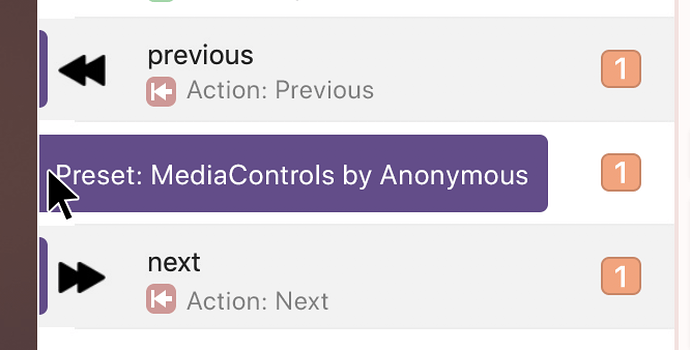
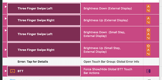
- The preset indicator is now only shown (on the very left) when a row is selected and is inspired by @yuuiko's suggestion
- Various crash fixes
- Various performance improvements
Next steps:
- Implement new settings UI (for settings like the General Touch Bar settings, Trackpad or Magic mouse settings).
Screenshots:
whoa! just wanted to say well done, glad to see progress here @Andreas_Hegenberg - I'll switch to latest alpha and help in finding issues as well
@Andreas_Hegenberg The most recent update (2.739) is consistently crashing (the entire application) every time I try to open the new preferences
ah could you send me the crashlog? (available in the macOS console.app under user reports).
Then I'll be able to fix it later today!
Here you go:
BetterTouchTool_2019-03-26-112540_Carters-MacBook-Pro.crash (84.1 KB)
Same crash here. Looks like some more significant progress, though! This is really going to speed up GC-BTT development  which is good because I've been in a bit of a funk since tax season and need to get back in a groove.
Ah thanks for the crashlogs! Seems to have crashed if a preset didn't have a color set explicitly. Quick workaround added to 2.740 - will think about whether to automatically assign random colors to all presets in the future.
2.740 is currently building and will be online in a few minutes.
v2.740 Feedback
Fixed 2.747
Bugs
- The Preset indicators don't appear in the table view
Visual Hitches
Show
-
The 'expand arrows' seem to get misaligned
-
Text overflow here:
-
Trouble with the sidebar. Disable icon inverting, adjust paddings and truncate text?
Recommendation Time!
Added 2.754
-Preset Indicators-
This update has been great! everything seems that little bit less confusing and neatened up.
The new preset indicators turned out well, but it would be great if they would always show them even if the trigger is not selected.
It's also hard to mouseover that little strip, so maybe make it's hitbox a bit wider to the right.
Apart from better icons, and the bugfixes above, the rest of the trigger section seems pretty good for me.
-Configuration Column-
I think the words here need to be minimised. I think something like this is enough to convey that it's the configuration of the selected trigger.
I guess you could make that "TouchBar Button" instead but yeah.
For actions, you'd have the icon, the action name as the bold title and then maybe "Change ▼" for the dropdown
Work on making it a bit more concise... Here's my try though it's a little rough
I also recommend reordering this:
- Title
- Enabled
- Background
- Icon
- New "Spacing", contains Size and Stick to
- Corners
- New "Visibility", contains Modifiers, Show options, Display Order
- HUD
- Repeat
- Long Press
How about this: I will accept the iOS-style sliding panels if you add two-finger swipe to go back 
@Andreas_Hegenberg, New modifier icons for you!
Icons have been implemented
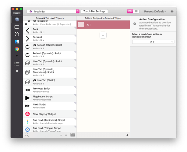
*that is an actual screenshot of the working app
They're based on your original images so you can pretty much chuck them straight in!
New BTT Modifier Icons.zip (119.5 KB)
