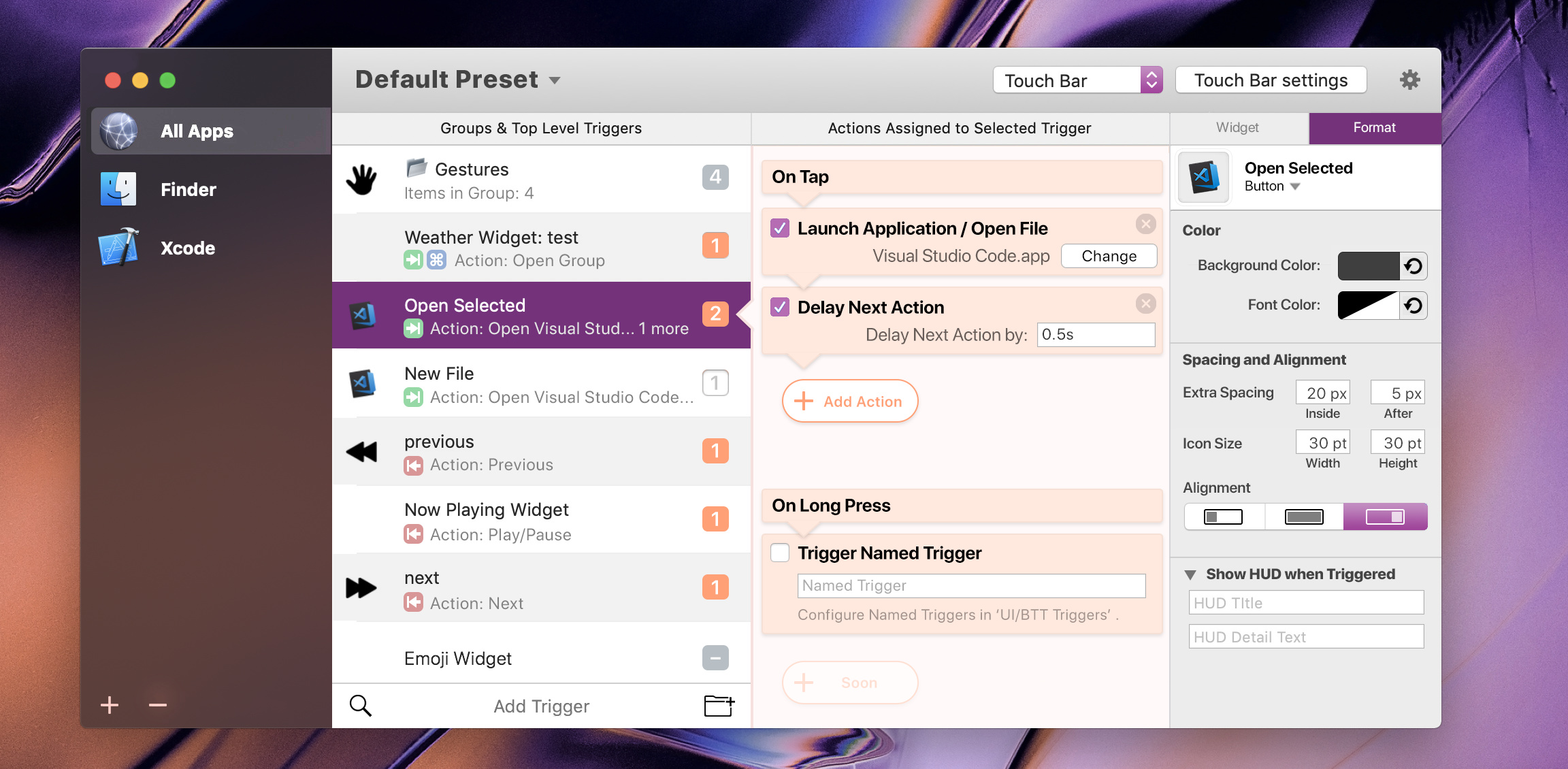
New mockup

@Andreas_Hegenberg, Stare at it and try imagine yourself using it before you open the notes below. See how many of the notes you can pickup without an initial explanation!
Notes
Toolbar
-
Device Triggers and Device settings moved to the right of toolbar. Also make that button longer than as displayed in my mockup (like yours in your latest posted update screenshot) as I think it needs more attention.
-
Click the 'Default Preset' title to change, well presets. This title will obvously change to the currently editing preset, (e.g. Aqua-Touch v2.1.1, GoldenChaos-BTT. 'Preset' will not always be added at the end, it's just the name. 'Default Preset' is the default name now.?
Triggers Column
-
Placement and Modifiers (in the subtext of the cells) are now icons in the trigger column. Saves space but remains there to see. Using the extra space we can add a preview of the actions like the current table view.
-
Preview of action/item counters that are in deactivated(4th from top), numbered(3rd), N/A(EmojiWidget) or Group states(1st).
-
Trigger Column (second from left) has alternating cell backgrounds now.
Left Apps Column
- Centered the Window Buttons.
- Improved the look of the current selection.
- Improved the Add and Delete buttons.
- Removed App-Specific button as this will appear in the Right Setup Panel on selection as explained in the Right Setup Panel section of these notes below.
Orange Actions Column
-
"Add Action" button modified. More Beginner Friendly.
-
My idea of Action modules are finally 'fully' mocked up. Get it now?
Checkboxes deactivate/activate modules.
When adding a new trigger, the default module already 'installed' would be the keyboard shortcut one, ready to either have a shortcut inputted into it, or deleted and replaced with predefined actions. -
I've mocked up the On Long Press(renamed) considering your temporary incompatibility. This would always show and won't be deletable untill you decide to implement the modular design fully.
-
Made colours pop more in Actions Panel. Note: No icons for the actions here. They are easy enough to recognise due to how the module itself looks, and their clear title. It would be good if icons remain in the "Add Action" Palette though, as thats a huge list and an icon is convenient in those. tldr: No icon in module, icons while adding.
-
Note the speech bubble 'triangles' on the left side border of the actions column and the modules. These give the user context and let the user know of what they are controlling.
Right Setup Panel
- Brief mockup of Right Setup Panel. Of course, more options will be added.
Note the 'Widget' and 'Format' tabs up top.
This is incorrect for the current selection as it is not a widget, but that widget button will appear if a widget is selected and is where the widget is set up. It's just for illustration purposes.
The proper display for the current selection would just be the format tab in grey with no widget tab. This tab will change to 'App Specific Behaviour' if an app is selected, etc. The dynamic title lets the user know what they are editing and what's selected.
Background Changes
-
Maybe add "Triggers" after each device, (e.g. - I referenced "Configure Named Triggers in UI/BTT Triggers". similarly, "MagicMouse Triggers", "Trackpad Triggers", "TouchBar Triggers", etc. (not mocked up here)).
To keep things neat, maybe only show "Triggers" when the dropdown is collapsed, and don't show "Triggers" in it's list. (if you can do this) -
"Other" trigger device renamed to "UI/BTT Triggers"
-
Collapsible attributes in Right Setup Panel if they are optional. (as seen in Show HUD)
What do you think of it?