Looking better!
v2.742 Feedback
Fixed 2.754
-
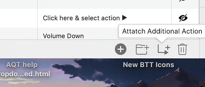
The new icons seem good, but still look a bit off. Maybe make the toolbar area white instead of the light grey, and add more spacing between the buttons. (and make the icons a bit smaller maybe?)
-
To keep things neat, maybe move the labels into tooltips that pops out
-
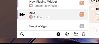
Visual bug with toolbar when a group is open and searching:
-
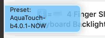
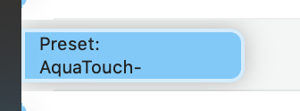
Issue with the preset labels: it can get cut off:
-
Use the + and - icons for the activation group column instead of text, also it should should be + - not - +
-
Accent line to left of actions should be a tint of orange. (it'll clean up the look)
-
Actions shouldn't grey out if clicking out to another column. Maybe pick a warmer color? the grey doesn't match with the background...
-
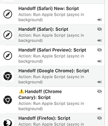
It's hard to see which triggers are hidden or not. So maybe try grey text for hidden triggers?
-
Pressing Space doesn’t work to show/hide
-
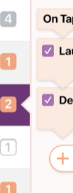
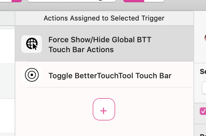
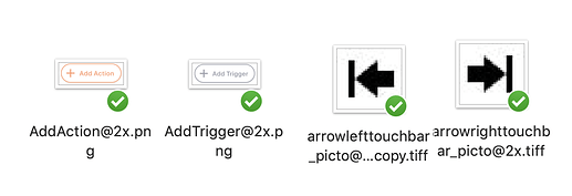
Be sure to remodel the add trigger / add action buttons with the image pack below!
New Icon Pack
I see you've made a new Touch Bar alignment icon, but it's a bit hard to see. I've revised it here in todays icon pack, which also includes new add icons.
You should be able to throw in the touchbar alignment icons, but the add buttons might need some configuration.
P.S. Did you know that having "@2x" at the end of a retina image will automatically render it for retina?
New BTT Icon Pack 1.zip (66.8 KB)
