GC menu bar menu doesn’t work after importing GC-BTT

Guilty, I did import the new Stable GC preset, without updating to the latest Alpha BTT version.

But therein lies the rub, The GCC preset is set to "Stable", while the underlying application is still in "Alpha" testing mode. It's great that GC updates so quickly, but this may be something where the expectations collide, and some middle ground should be found?

@GoldenChaos Good points!

I'm trying to make this one dialog and do not allow imports if the minimum version is not matched. Would be great if you could test v3.394 alpha.

I still need to show these warnings and some info about the settings override, which makes the dialog relatively big.

I'd appreciate any ideas to make it simpler while still maintaining the same info ...

2 Likes

This is exciting, I will post my own design for this dialog shortly :slight_smile:

Also, I just want to throw this out there: It would be a lot more intuitive if BTT presets behaved more like Safari extensions and required copying to a custom preset in order to be modified. This would allow auto-updates to presets to work reliably. This would also allow me to define some metadata for my preset, such as an icon and banner image, that would add branding to the dialog and make it look much more official. This metadata could be defined by me in the eventual preset sharing site, which could essentially run like an extensions gallery. Honestly, you could literally bill BTT as “a macOS extension system” at that point and I think it would be pretty accurate haha. I’ll make some mockups of this extra idea too.

Metadata is already possible with the current presets (e.g. adding BTTPresetInfoURL to the JSON adds a custom URL that is shown as an info button the import view) BTTPresetBrandImage adds some image (but it's not yet rendered, I haven't decided on the allowed dimensions yet.)
You'll be able to set these soon with the upcoming sharing platform update.

I think I don't understand your Safari extension like idea yet, what would be the difference to now? Not replacing items the user has copied to his own preset when auto-updating?

On it!

@Andreas_Hegenberg @GoldenChaos

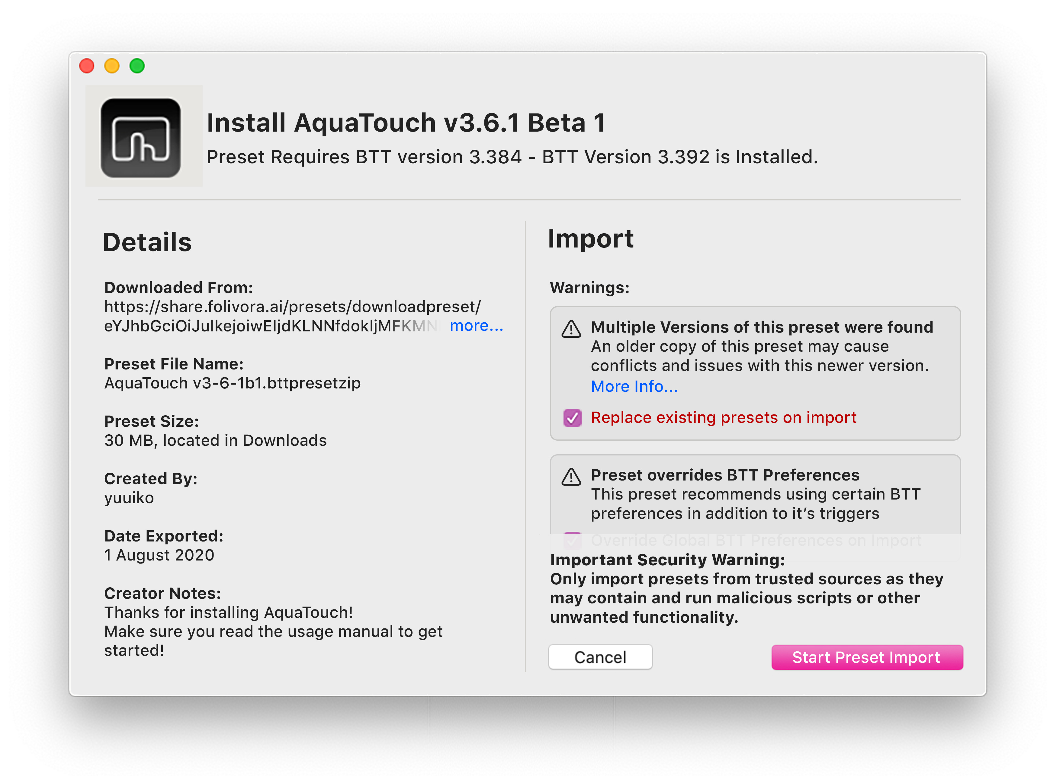
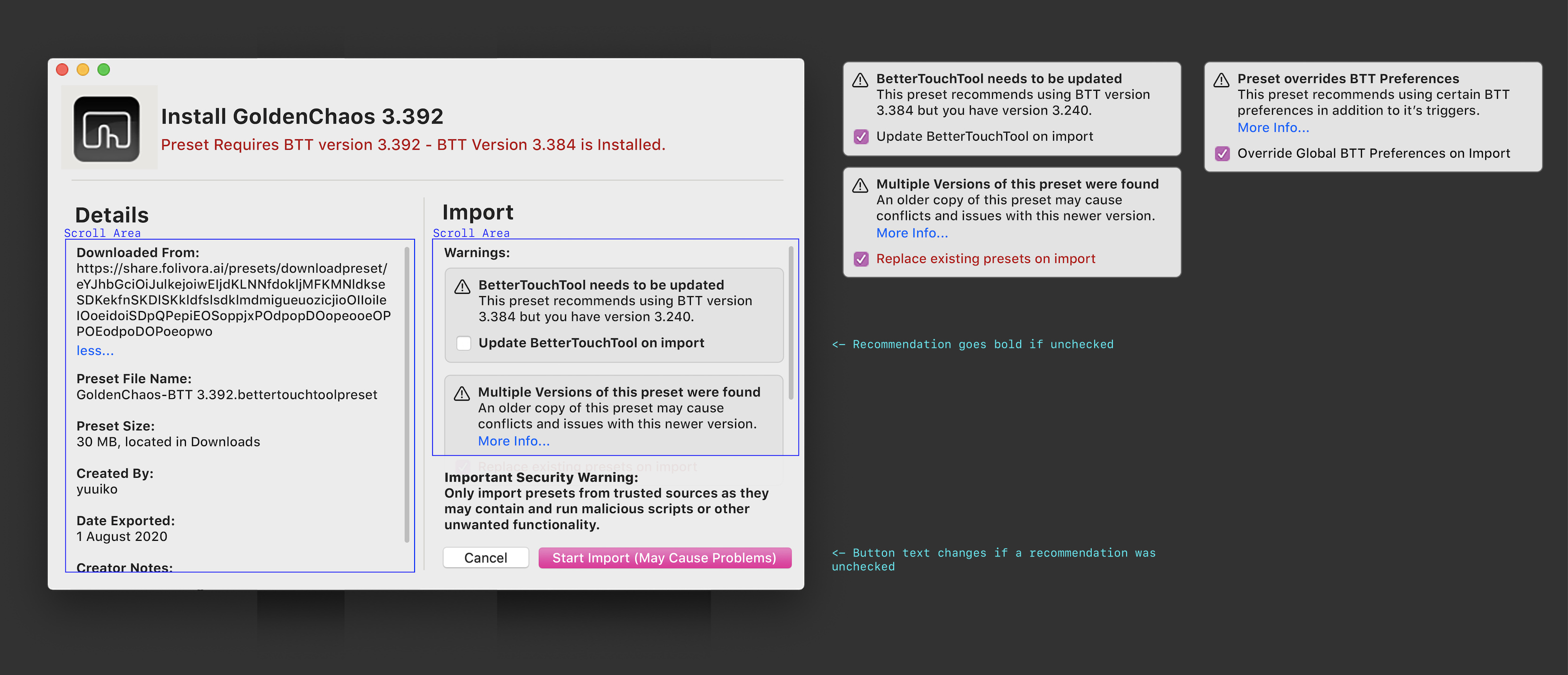
Just finished the mockup!

I think he was trying to say something like imported presets won't be editable unless the user makes their own copy

looking good! I'll try to get it close to this :slight_smile:

1 Like

First similar implementation in v3.396 (uploading now)


1 Like

Working on my version right now, I’ll keep this in mind. I have a “compact” version that I think would make a better default display, which could be expanded into this for more info :slight_smile:

1 Like

Initially I also thought it was a bit big, but after trying it, I feel the size also signifies that something important is happening. (Maybe the users are more likely to look at the checkboxes then...)

1 Like

I think it should be more like Apple’s crash dialog (in UX, not design). Simple and compact by default, expand for more info. Plus, the security warning should use info from the sharing site to display verified/unverified status. Anyways, I think this is a great start, so I’m gonna go heads-down for an hour and make something nice :smiley:

Yup deeper integration with the sharing site is definitely coming, I also want to be able to track the number of actual installs.
In the future I'll show a different security warning for verified presets, but I need to finally get a first version of the new sharing platform out before doing this :slight_smile:

Working my way through the various scenarios here, I think I'm getting close :slight_smile: so far:

Random thoughts: Still missing the checkbox options, preset description (renamed from "creator notes"), and a "more info" panel. I think presets should also have their own optional version number. I also like renaming "import" to "install". As for the upgrade dialog, I actually don't think it's important to say which version is required specifically, just whether it is or is not, at least outside of the "more info" drawer.

Now I need a short break for food lol. Will have another screenshot after I eat!

Getting warmer! All basic attributes that I think matter for this "compact" display are now here. I don't think file size, file name, or file location matter because the user presumably clicked on it themselves. That stuff can go under "more" imo.

1 Like

I based my design off an app store page. Maybe some different info could be better such as a preset introduction or just one big image for the left column.

I wanted to ensure that descriptions are clear and worded out so that people know what things mean and what BTT will do.

I agree that mine might need to be made a little more concise but not so much that descriptions about, say duplicate presets, are removed. as if the are, a new user might go "whats a duplicate preset?" hit the write-over button then loose all their edits... And damn, if they made an entirely new preset from an existing preset then thats a big loss

Just saw it working!
I Understand that it's a wip.

Initial feedback:
I think the "Change" button in the title next to the filepath is a bit unneccesary as the user clicked the preset to open anyway. Doesn't make much sense to find a file to import from finder, then want to change which one to import

Can move window by dragging it's body! Awesome. The bezel-less alert windows in big sur don't do this and its pretty annoying to try guess where the top titlebar of the window is to move it.

Screen Shot 2020-08-02 at 6.28.10 am
Good idea, though maybe not linking to an external site lol. Maybe a small what do you call those, speech bubble popup could appear, like the preset selector in BTT or action pallete but instead it would contain just the info about the warning

Caution icons don't adapt to dark mode. In mine i used an SF symbol, but probably just make an inverting image. Also the large icon is a little out of place

I disagree that the user won't know what's going on - they installed the preset after all! But I'll add something that makes it even more obvious :slight_smile:

Most strongly I feel that people just won't read all the text in this first design, which could lead to people to click yes without thinking. In particular I think the "details" pane is just completely unnecessary and distracting - remove that (or hide it behind a collapsible box), and that's basically much closer to what I'm proposing.

Also, since we're sharing inspirations, mine is based on adding a shortcut in Apple Shortcuts! I think that dialog is a lot closer to the type of functionality BTT presets offer.

Will expand on my concept further tomorrow!

1 Like

I agree that some parts of the details box (like the file name or file size) might currently only be relevant to developers, but I think in the future this could also show some other things like the download count or some user rating (when coming from the sharing platform).
However the preset info link and preset description / creator notes could already be quite useful imho (they can now be provided when exporting a preset). For example I have seen GoldenChaos being shared on some other forum without much description - having at least a link to your website or to your forum thread would probably help here.

I think the security warning should be shown in all situations (even if a preset has been verified by me - although then it should be worded a bit differently).

I think in a first step I'll release a version similar to what's in the alpha right now (will fix the dark mode icon issues later today). This should be flexible enough to improve on in the next versions. For example it might be a good idea to have only one column if there are no warnings.

1 Like

I see it's now live! well done.

One thing though, It seems the BTT window doesn't open after import anymore, could this be brought back, as my preset relies on the BTT window being frontmost to check it's version numbers and start it's custom initialisation