Hey there, I have a few questions, or if not possible, suggestions.
-
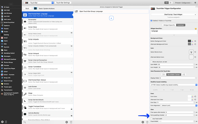
See screenshot of the touch bar, and find the 2-pointed-arrow in red. Tell me that space between the "Windows Controls" text and the next icon can be minimized? I already aligned text right and icon left, but still, there is too much space. "Windows Controls" text should rather appear as a "label" for the coming few icons to its right - I use a button for it right now, as there seem not any method to give a label to icons on their left anyway. Is it somehow possible to minimize these gaps further?
-
Are there placeholders that can be used in the Name of Touchbar buttons, for example,
{AppName}where{AppName}would be replaced by the currently active (under mouse) app name?
This could be used for things like a dynamic label for anything, such as "Close {AppName}" (see screenshot the "X close" button) -
Again space - between any Touchbar Button icon and its touch bar Button Label (if shown), is too wide, how can we control that?
Thanks for any hints 


